Tuesday, January 27, 2015

Echo Chamber at Climate Audit

I have been posting comments at Climate Audit for about eight years. They have generally been at odds with the prevailing thinking there, but have been, I think, fact-based, referenced, on topic and polite. And they have generally appeared, and attracted a vigorous response.

Recently there have been difficulties. I mentioned here back in September a problem that was affecting me at all Wordpress blogs. That was basically due to Akismet and has now gone away. This one is new.

At some stage during this thread, all my comments started going into moderation. At CA that is a semi-ban; moderation can take a day, and it is impossible to engage in any sort of dialogue. But then they started not to emerge at all.

Steve edits firmly at times, in ways that I don't object to. But it's usually transparent. What I do find objectionable is that recent threads have often been quite erroneous, and correction strongly resisted, and now suppressed.

A recent example of error was this, accusing Sven Teske of being a leader of the Nazca vandalism, based on a post of Shub Niggurath. In fact Shub hadn't said that, and clarified his comment. There was no other evidence, but although this was pointed out early (not first by me) there was no response or correction.

I'm writing now about his latest post. It is headed "Important New North American East Coast Proxy Data", and introduces the results of Sicre et al on alkenone analyses off Newfoundland. It suggests that they undermine the results of Marcott et al: "Obviously the Sicre 2014 results provide further evidence against Marcott’s supposed early-20th century blade. At the time, I pointed out that the Marcott blade does not exist in the data and is entirely an artifact of incorrect data handling. To borrow a term from Mark Steyn, the Marcott blade was f……..flawed. It is reprehensible that Marcott and coauthors have failed to issue a corrigendum."

And darkly suggests that they are quietened by the consensus: " Unsurprisingly, the new data was not press released and has thus far attracted no attention."

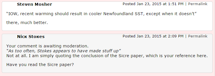
Well, I read all this and noticed that there were no quotes or references to what the paper actually said. It was based on the archived data and the notes with it. I wondered whether SM had read the paper, which was paywalled. None of the comments seemed to refer to it either.

So I read it, and it seemed to tell a quite different story. The focus of the authors is on the movement of the Labrador Current, which is very cold, and here not so far from the North Atlantic current (Gulf Stream, warm). They spend a lot of time talking about how the LC depends on strength of the NW winds, and may go quite differently to NH SST. The abstract says:
The ice-loaded Labrador Current (LC) is an important component of the western North Atlantic circulation that influences the position and strength of the northern limb of the North Atlantic Current (NAC). This flow of cold and fresh Polar Waters originating from the Arctic has a marked impact on the North Atlantic climate, yet little is known about its variability beyond the instrumental period. In this study, we present the first sub-decadal alkenone-based 2000-year long sea-surface temperature (SST) records from the western Labrador Sea, a climatically crucial region at the boundary between the LC and the NAC. Our results show a clear link between the LC strength and the Northern Annular Mode (NAM), with a stronger NAM and a more vigorous LC during the Medieval Climate Anomaly (MCA). This suggests enhanced LC activity upon future global warming with implications for the Atlantic meridional overturning circulation (AMOC).

So I commented. That comment, "Posted Jan 22, 2015 at 8:51 PM", stayed in moderation for a while, so I thought I would try something that seemed to work earlier, and submitted another version ("Posted Jan 23, 2015 at 1:26 AM") with my name slightly varied, and with a figure. Some time later those both appeared, with a response to the first.

It said, inter alia,
"I presume that you agree that the alkenone SST data indicates substantially warmer mid-Holocene East Coast temperatures than 20th century temperatures. Again, if you wish to argue that this is an expected theoretical outcome and provide references to authors who previously advocated this position"

Odd. I wasn't referring to that at all. Neither were Sicre et al; their results cover just 2000 years. It's in their title. And I was just quoting what they say. So I responded here. This went into moderation, but appeared quite soon. The response:
"Nor is Stokes’ theory of a cold MWP in Labrador consistent with other information discussed here"

Well, it's not my theory. It's Sicre et al, and I had showed their Fig 6. But by now, I was fairly convinced that Steve hadn't read the paper, so I asked:


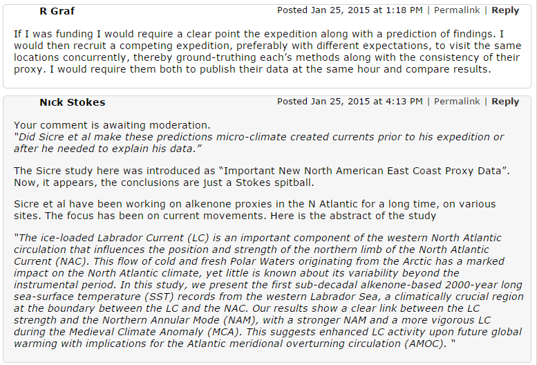
That is still in moderation, three days later. Meanwhile, there was a little further commentary, based on a claim that SST in Placentia bay had not gone down. I had pretty much given up at that stage, but one query by R Graf  (above the one shown) seemed addressed to me so I sought to respond:


Still in moderation. So I had pretty much lost interest, when I saw that Steve McIntyre had, four days after my first comment, come up with a substantial response. It seems he has finally read the paper. But not allowed my earlier comments.

I'll respond a little here. He says
"Stokes says that Sicre et al “chose sites that are very sensitive to movements in the Labrador Current”. This is either an error or a fabrication in respect to the Placentia Bay site, used in the main comparison with Sachs et al 2007 Laurentian Fan site.
...
Sicre et al explicitly stated that the “SE site” (Placentia Bay) was in the “boundary zone between the Labrador Current and the Gulf Stream”. "

Exactly. The boundary zone is very sensitive to movements.


"Stokes asserts that Sicre et al 2014 postulated an “antiphase” relationship between the NE Bonavista Bay site (in the Labrador Current) and offshore Iceland.
...
There is no observable “antiphase” relationship between the Placentia Bay site and MD99-2275."

Yes. But this data is presented as a contradiction the the Marcott claim that temperatures rose in modern times. Whether antiphase or neutral, it does not provide that contradiction.

Update 11.22AM 27/01 Well, well. I see that my second comment there has now appeared, with a response. The screenshot I showed was timestamped 9.52 AM 27/01, both Melbourne time. The response basically argues that you can like the data without liking what the authors say about it.


Sunday, January 25, 2015

Trends, breakpoints and derivatives - part 2

In part 1, I discussed how trends worked as a derivative estimate for noisy data. They give the minimum variance estimator for prescribed number of data points, but leave quite a lot of high frequency noise, which can cause confusion. I also gave some of the Savitsky-style theory for calculating derivative operators, and introduced the Welch taper, which I'll use for better smoothing. I've chosen Welch (a parabola) because it is simple, about as good as any, and arises naturally when integrating (summing) the trend coefficient by parts.

I gave theory for the operators previously. The basic plan here is to apply them, particularly second derivative (acceleration) to see if it helps clarify break points, and the general pattern of temperatures. The better smoothing might seem contrary to detecting breakpoints, since it smooths them. But that actually helps to avoid spurious cases. I'll show here just the analysis of GISS Land/Ocean.

I'll start with the spectrum of acceleration below. As I said in Part 1, you can actually get much the same results by differencing the smooth (twice for accel), or smoothing the difference. But the combined operator shows best what is happening in the frequency domain.

Spectrum of acceleration

Here is a plot of the spectra for acceleration, as with trend in part 1.


Some points:
  • Each of the operators is now quadratic for low frequencies, as differentiation requires. As the frequency (1/width) = 10 /Cen is approached, the response again starts to taper. This is the effect of smoothing at higher frequencies.
  • Each operator then has pronounced band-pass character, slightly more so than with trend. This will show in their behaviour.
  • You can still see the increasing order of roll-off, though each is slower than the corresponding trend spectrum.

Gradient plots

The active plot below shows gradients with 10,20 and 30 year filters, on 13 different datasets. Each plot shows the three different tapers ("Regress" (red) is just OLS). You can use the buttons at the top to change data set or filter length.

Length yrsDataset


The plot you see first here is GISS Land/Ocean monthly, 30 year filters. The filter is centered, so you see an estimate of the derivative at the year marked on the axis. There is no padding, so the plot stops at 2000. Some notes:
  • The trend is mostly positive (warming).
  • As the smoothing increases, there is more pronounced amplification around the filter period (30 yrs). Inevitably, most of that is noise. But it happens even with the OLS trend.
  • There is no radical change as smoothing increases, but the blue curve strips away high frequency detail, which probably had little meaning.
  • What remains are the familiar features - warming 1910 to near 1940, then a hiatus, then warming from about 1975 on, with a max trend (not a pause) at about 2000. Some sign of deceleration there, although it could be just the amplification of the 30 yr band.

Acceleration plots

Now we are estimating second derivative, which should be mostly the derivative of the above. This will be clearer with the W2 blue curve. The main thing to look for are spikes (+ or -) to indicate break points, where the derivative changes.
Length yrsDataset


  • The spikes aren't very pronounced. There is conflict between the want to remove HF noise, and preserving the spike. So the smoothest line shows smoothish spikes, but that is abtually the meaningful part. It isn't really better without smoothing. So here we see 1910 and 1940 as the most prominent features, with a reasonable peak around 1972 (it's really hard now to pin down a year, as it should be). At this resolution, no sign of a peak at 2000.
  • Going to shorter periods doesn't really reveal more. There is just more noise at about the periodicity of the filter length.


More about the datasets

  • HadCRUT - HADCRUT 4 Land/Ocean
  • GISSlo - GISS Land/Ocean
  • NOAAlo - NOAA Land/Ocean
  • UAH5.6 - UAH Lower Troposphere
  • RSS.MSU - RSS Lower Troposphere
  • TempLSgrid - Land/Ocean
  • BESTlo - Land/Ocean
  • C.Wkrig - Cowtan and Way kriging Land/Ocean
  • TempLSmesh - Land/Ocean
  • BESTla - Land Only
  • GISS.Ts - Met stations
  • CRUTEM - Land Only
  • NOAAla - Land Only
  • HADSST3 - Sea Surface
  • NOAAsst - Sea Surface

Wednesday, January 21, 2015

Trends, breakpoints and derivatives

This post is partly following a comment by Carrick on acceleration in time series. We talk a lot about trends, using them in effect as an estimate of derivative. They are a pretty crude estimate, and I have long thought we could do better. Acceleration is of course second derivative.

Carrick cited Savitzky-Golay filters. I hadn't paid these much attention, but I see the relevant feature here is something that I had been using for a long time. If you want a linear convolution filter to return a derivative, or second derivative etc, just include test equations applying to some basis of powers and solve for the coefficients.

I've been writing a post on this for a while, and it has grown long, so I'll split in two. The first will be mainly on the familiar linear trends - good and bad points. The second will be on more general derivatives, with application to global temperature series.

Trends

We spend a lot of time talking about linear trends, as a measure of rate of warming (or pause etc). I've made a gadget here to facilitate that, even though I think a lot of the talk is misguided. Sometimes, dogmatic folk insist that trends should not be calculated without some prior demonstration of linear behaviour.

A silly example of this came with Lord Donoughue, in the House of Lords, monstering a Minister and the MetOffice, with Doug Keenan pulling the strings. The question was a haggle over significant rise, with Keenan badgering the MO to calculate it his pet way, the MO saying (reasonably) that they don't talk much about trends, accusations of the MO using inappropriate models etc. It really isn't that hard. A trend is just a weighted sum of readings. It has the same status as any other kind of average, and it has uncertainty like that of the standard error of the mean.

Trend as derivative

But a time series trend β can be seen as just a weighted average of derivatives. To see this in integral form:
β=∫xy dx/∫x² dx
where x is from -x0 to x0. Integrating by parts:

β=∫W(x0,x)y'(x) dx where W=(x0²-x²)/∫x² dx
W is a (Welch) taper which is zero at the ends of the integration range. I'll be using it more. But while it damps high frequencies, with roll-off O(1/f²) in the frequency domain, the differentiation itself brings back a factor of f, so net effect is O(1/f).

In the next post I'm looking at the effect of better noise suppression.

Trend as Savitsky operator

In my version of the Savitsky process for time series (x), I take a filter W and ask for the polynomial P that satisfies constraints
xP(x) W(x) xi=ci
where the order of P equals the number of constraints. This is a linear system in the coefficients of P. P(x) W(x) will be the operator. For a differentiation operator, c=(0,1). You can go to higher order with c=(0,1,0,0) etc. For second derivative, c=(0,0,2).

Symmetry helps. If W is symmetric (x is centered),
P(x)= x/∑x2W
and the trend coefficient of series y is β = ∑x*yW
/ ∑x2W
If W is the boxcar filter, value 1 on a range, this is the OLS regression formula.

OLS trend as minimum variance estimator

A useful property to remember about the ordinary mean is that it is the number which, when subtracted, minimises the sum of squares. There is a corresponding property for OLS trend. It is the operator which, of all those Vi satisfying
Vixi=1 (summation convention)
has minimum sum squares ViVi. That is just an orthogonality property. And since for any time series y, Viyi is the trend estimate β, the variance of that estimate is (ViVi)* var(y). So of all eligible V, the OLS trend has minimum variance.

The good and bad

So trend is a minimum variance estimate of derivative, but with poor noise damping. I'll compare next with operators where W is a quadratic taper, coming down to 0 at the ends, so continuous (Welch window). As smoother, it thus gives high frequency roll-off O(1/f2). W2 (Parzen window) then has continuous derivative, and roll-off O(1/f3).

So here is a plot of the spectra, tapers centered so the spectrum is pure imaginary. The OLS trend operator is colored red, and given a 10-year period (width).


Some points:
  • Each of the operators is linear for low frequencies, as differentiation requires. As the frequency (1/width) = 10 /Cen is approached, the response starts to taper. This is the effect of smoothing at higher frequencies. The smoother tapers have a later cut-off, because they are effectively narrower in the time domain.
  • Each operator then has some band-pass character. This will show in their behaviour. It is an inevitable consequence of combining a linear start with a hf roll-off.
  • You can see the 1/f roll-off at high frequencies, compared to the other operators. This is the bad feature of trend as a derivative. If you have decided on a cut-off, you want it to be observed. The operator is no longer differentiating properly (linear), and so is unhelpful at higher frequencies. It is best if it fades quickly.

Next

In the next post I'll show the effect of the filters on temperature series, and discuss matters like acceleration and the identification of breakpoints.


Historic progress of temperature records

2014 as a record warm year has been in the news lately. I made plots of the progress of the current "record year" in each of the usual datasets (as plotted here). Each rectangle shows on left, the height of the then record year, and the time it held the record. Datasets are listed below the graph.

There have been suggestions that records are a figment of adjustment processes. The TempLS plots shown are based on unadjusted GHCN and ERSST 4.

The plots are based on annual averages to date. For eg HADCRUT and Cowtan and Way, that means 2014 to November. Use the buttons to click through.


Glossary

  • HadCRUT - HADCRUT 4 Land/Ocean
  • GISSlo - GISS Land/Ocean
  • NOAAlo - NOAA Land/Ocean
  • UAH5.6 - UAH Lower Troposphere
  • RSS.MSU - RSS Lower Troposphere
  • TempLSgrid - Land/Ocean
  • BESTlo - Land/Ocean
  • C.Wkrig - Cowtan and Way kriging Land/Ocean
  • TempLSmesh - Land/Ocean
  • BESTla - Land Only
  • GISS.Ts - Met stations
  • CRUTEM - Land Only
  • NOAAla - Land Only
  • HADSST3 - Sea Surface
  • NOAAsst - Sea Surface

Tuesday, January 20, 2015

So 2014 may not have been warmest?

That has been the meme from people who don't like the thought. Bob Tisdale, at WUWT, gives a rundown. There is endless misinterpretation of a badly expressed section in the joint press release from NOAA and GISS announcing the record.

The naysayers drift seems to be that there is uncertainty, so we can't say there is a record. But this is no different from any year/month in the past, warmest or coldest. 2005 was uncertain, 2010 also. Here they are, for example, proving that July 1936 was the hottest month in the US. Same uncertainties apply, but no, it was the hottest.

So what was badly expressed by NOAA/GISS. They quoted uncertainties without giving the basis for them. What do they mean and how were they calculated? Just quoting the numbers without that explanation is asking for trouble.

The GISS numbers seem to be calculated as described by Hansen, 2010, paras 86, 87, and Table 1. It's based on the vagaries of spatial sampling. Temperature is a continuum - we measure it at points and try to infer the global integral. That is, we're sampling, and different samples will give different results. We're familiar with that; temperature indices do vary. UAH and RSS say no records, GISS says yes, just, and NOAA yes, verily. HADCRUT will be very close; Cowtan and Way say 2010 was top.

I think NOAA are using the same basis. GISS estimates the variability from GCMs, and I think NOAA mainly from subsetting.

Anyway, this lack of specificity about the meaning of CIs is a general problem that I want to write about. People seem to say there should be error bars, but when they see a number, enquire no further. CI's represent the variation of a population of which that number is a member, and you need to know what that population is.

In climate talk, there are at least three quite different types of CI:
  • Measurement uncertainty - variation if we could re-measure same times and places
  • Spatial sampling uncertainty - variation if we could re-measure same times, different places
  • Time sampling uncertainty - variation if we could re-measure at different times (see below), same places
I'll discuss each below the jump. (The plot that was here has been moved to new post)

Measurement uncertainty

This is least frequently quoted, mainly because it is small. But people very often assume it is what is meant. Measurement can have bias or random error. Bias is inescapable, even hard to define. For example, MMTS often reads lower than thermometers. It doesn't help to argue which is right; only to adjust when there is a change.

I speak of a random component, but the main aspect of it is that when you average a lot of readings, there will be cancellations. A global year average has over a million daily readings. In an average of N readings, cancellation should reduce noise by about sqrt(N); in this case by a factor of 1000.

Spatial sampling uncertainty

That is present in every regional average. As said above, we claim an average over all points in the region, but have only a sample. A different sample might give a different result. This is not necessarily due to randomness in the temperature field; when GISS gives an uncertainty, I presume that reflects some randomness in choice of stations, quite possibly for the same field.

A reasonable analogy here is the stock exchange. We often hear of a low for the year, or a record high, etc. That reflects a Dow calculation on a sample of stocks. A different sample might well lead to a non-record. And indeed, there are many indices based on different samples. That doesn't seem to bother anyone.

What I find very annoying about the GISS/NOAA account is that in giving probabilities of 2014 being a record, they don't say if it for the same sample. I suspect it includes sample variation. But in fact we have very little sample variation. In 2010 we measured in much the same places as 2014. It makes a big difference.

Time sampling uncertainty.

This is another often quoted, usually misunderstood error. It most frequently arises with trends of a temperature series. They are quoted with an uncertainty which reflects a model of variation within timesteps. I do those calculations on the trend page and have written a lot about what that uncertainty means. The important distinction is that it is not an error in the trend that was. It is an uncertainty in the trend that might have been if the climate could be rerun with a new instance of random variation. That might sound silly, but it does have some relevance to extrapolating trends into the future. Maybe you think that is silly too.

Briggs has a muddled but interesting article, trenchantly deprecating this use of CI's. RealClimate cited a trend (actually just quoting Cowtan and Way) as 0.116 +/- 0.137. Said Briggs:
"Here’s where it becomes screwy. If that is the working definition of trend, then 0.116 (assuming no miscalculation) is the value. There is no need for that “+/- 0.137? business. Either the trend was 0.116 or it wasn’t. What could the plus or minus bounds mean? They have no physical meaning, just as the blue line has none. The data happened as we saw, so there can not be any uncertainty in what happened to the data. The error bounds are persiflage in this context."


I don't totally disagree. 0.116 is the trend that was. The interesting thing is, you can say the same about the commonly quoted standard error of the mean. Each is just a weighted sum, with the error calculated by adding the weighted variances.

I've used this analogy. If you have averaged the weights of 100 people, the CI you need depends on what you want to use the average for. If it is to estimate the average weight of the population of which they are a fair sample, then you need the se. But if you are loading a boat, and want to know if it can carry them, the se is of no use. You want average instrumental error, if anything.

And the thing about trend is, you often are interested in a particular decade, not in its status as a sample. That is why I inveigh against people who want to say there was no warming over period x because, well, there was, and maybe a lot, but it isn't statistically significant. SS is about whether it might, in some far-fetched circumstances, happen again. Not about whether it actually happened.

Briggs is right on that. Of course I couldn't resist noting that in his recent paper with Monckton, such CI's featured prominently, with all the usual misinterpretations. No response - there never is there.

Statistical Tie

OK, this a pet peeve of mine. CI's are complicated, especially with such different bases, and people who can't cope often throw up their hands and say it is a "statistical tie". But that is complete nonsense. And I was sorry to see it crop up in Hansen's 2014 summary (Appendix) where 2014, 2010 and 2005 were declared to be "statistically tied".

You often see this in political polling, where a journalist has been told to worry about sampling error, and so declares a race where A polls 52%, B 48% with sampling error, as a "statistical tie".

But of course it isn't. Any pol would rather be on 52%. And such a margin close to the election usually presages a win. Any Bayesian could sort that out.

2014 was the warmest year. It doesn't matter how you juggle probabilities. There is no year with a better claim.


Thursday, January 15, 2015

Temperatures 2014 summary

I headed the last post on 2014 "Prospects for surface temperatures 2014 final". In my town, the evening paper used to come in three editions, announced by many newsboys - Final, Late Final, and Late Final Extra. So this is Late Final - my excuse is that GISS is dragging its feet (and NOAA hasn't even posted its November MLOST file).

I ran the TempLS Grid version, and it showed a considerable rise for December - from 0.518°C to 0.638°C. That actually makes December the warmest month of 2014. TempLS Mesh is also showing a greater rise with extra data, now from 0.59°C to 0.655°C. So I think it is time to make predictions (while we wait):

2014 Jan-Dec2010 Jan-Dec
GISS Land/Ocean0.670.66
NOAA L/O0.680.65
HADCRUT 40.5630.556


This is on the basis that GISS agrees with TempLS mesh, and NOAA/HADCRUT with TempLS grid. As you see, HADCRUT and GISS narrowly reach a record, NOAA with more to spare. Actually, my GISS estimate came to 0.675, so 0,68 is equally likely.

Update: GISS and NOAA have now released their results with a  joint press release. GISS gave 0.68°C as their 2014 value; NOAA announced 0.69°C (re 20th Cen ave, it's worse than I thought ;)).

Update. There is an active plot of the historic record years of all major indices (and also both TempLS) in this later post.

Friday, January 9, 2015

December TempLS up 0.045°C - some 2014 records likely

After earlier (false) signs of a greater rise, with 3833 stations reporting, TempLS mesh has risen from 0.591 in Nov to 0.636 in Dec 2014. The Nov number rose a little with later data, so Dec is now back to October levels. The report is here.

The Ncep/Ncar index showed a similar fall/rise, but only came back to about August level. GISS should track the TempLS mesh level reasonably, so a record is likely there, as with NOAA. HADCRUT remains uncertain.


Monday, January 5, 2015

Monckton and Goddard - O Lord!


Viscount Monckton of Brenchley has produced yet another in his series of the "Great Pause" - now 18 years 3 months. He uses only the troposphere average RSS - to quote Roy Spencer  on how RSS is differing from his UAH index:
"But, until the discrepancy is resolved to everyone’s satisfaction, those of you who REALLY REALLY need the global temperature record to show as little warming as possible might want to consider jumping ship, and switch from the UAH to RSS dataset."

Lord M heard. But in his latest post he is defensive about it. He says:
"But is the RSS satellite dataset “cherry-picked”? No. There are good reasons to consider it the best of the five principal global-temperature datasets."

There is an interesting disagreement there. Carl Mears, the man behind RSS, says
"A similar, but stronger case can be made using surface temperature datasets, which I consider to be more reliable than satellite datasets (they certainly agree with each other better than the various satellite datasets do!)."

You can see in this plot how much an outlier RSS is. The plot shows the trend from the date on the x-axis to present. You can see the blue RSS crossing the axis on the left, around 1996. That is Lord M's Pause. No other indices cross at all until UAH in 2008. In the earlier years, UAH often has the highest trend.


Anyway, Lord M cites in his defence "The indefatigable “Steven Goddard” demonstrated in the autumn of 2014 that the RSS dataset – at least as far as the Historical Climate Network is concerned – shows less warm bias than the GISS [3] or UAH [2] records."

He shows this graph:


No details on how HCN is done, but certainly there is no TOBS adjustment, which for USHCN is essential. That is the main problem, but the clearly wrong averaging contributes. In the past, Goddard has vigorously defended his rights as a citizen to just average all the raw data in each month (eschewing anything "fabricated"), and I'm sure that is what we see here.

So what is wrong with it? We saw the effects in the Goddard spike. The problem is that in each month, a different set of stations report. SG is averaging the raw temperatures, so what kind of stations are included can have big differences in average temp, without any actual change in temp. If a station in Florida drops out, the US average (SG-style) goes down. Nothing to do with the weather.

NZ Prime Minister Muldoon understood this. When the NZ economy hit a rough patch, he was scornful of locals leaving for Australia. But he took consolation. He said that this would improve the average IQ of both countries. It helped me - I can now figure out what he meant.

I wrote at some length about the Goddard spike issues here. But this example gives a simple case of the problem and an easy refutation of the method.

Every month, a different group of stations reports. Suppose we switch to a world in which temperatures do not change from year to year. Each reporting station reports the long term average for that month. So there is no change of actual weather (except seasonal). But the population of stations reporting varies in the same way as before.

For a fixed subset of stations, the average would be constant, as it should. But here it isn't. In fact, over time, the average goes down. That is because the stations dropping out (as they have, recently) tend to be warmer than most. I don't know why, but that is what the graph shows. It covers the period from 1979 to 2013, and shows the Goddard average raw in blue and the average of averages in red. It also shows the trends over this time, with slope on the legend in °C/century.


And that is the key. The cooling (in long term average) of the set of reporting stations induces a spurious cooling trend of 0.33°C/cen. That isn't large relative to the actual warming trend, but it makes a significant difference to the plots that Lord M showed. And it is simple error.


Sunday, January 4, 2015

Prospects for surface temperatures 2014 final

The NCEP/NCAR daily data is in now for December 2014 (here). It was an up and down month - cold start, then very warm leading up to Christmas, then cooling again. The end average was 0.212°C, which makes it a little cooler than August, but a lot warmer than November.

So it is a weakly warming influence on the cumulative sum I am tracking. I'll show below the latest plots of the various indices, in the style of this post and its predecessors; the only update is really HADCRUT. That sum dropped in November, and will be very very close to 2010. NOAA and HADSST3 are well clear, and will be a record. GISS has a fair margin, and should clear.

I'll post in a day or two on the update to TempLS mesh, which should be a better guide to the prospects for GISS.

Update: My TempLS system decides when it can run, based mainly on arrival of ERSST data. It has, and a report is here. Still a lot of land data missing, so I won't post on it for a while. I mention it here because contra NCEP/NCAR, it showed a huge rise in temperature. 0.16°C. That will change, but not greatly, I think. Warmth right across Eurasia, and even N America.
Update: On looking further, this may be an artefact from too little high latitude NH data. ERSST hasn't risen much.
The index will be a record if it ends the year above the axis. Months warmer than the 2010 average make the line head upwards.

Use the buttons to click through.