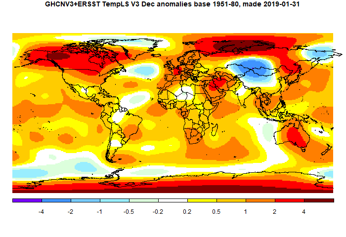
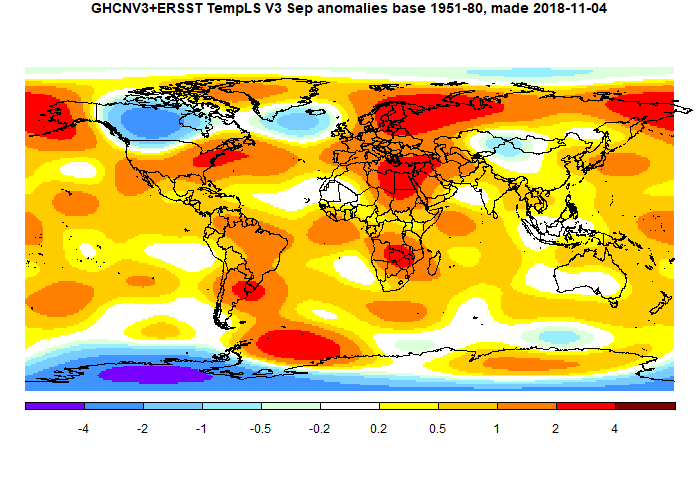
The GISS land/ocean temperature anomaly fell 0.21°C last month. The November anomaly average was 0.77°C, down from October 0.98°C. A big fall, exceeding the TempLS fall of 0.163°C. Both indices reversed a very similar rise in October. Jim Hansen's report is here.
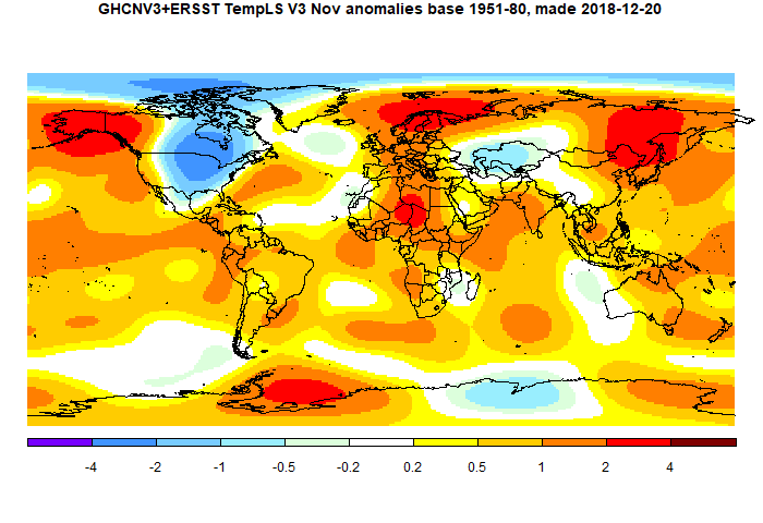
The overall pattern was similar to that in TempLS. Cold in Canada and US, except W Coast. Warm in E Siberia and Alaska, and most of Arctic except near Canada. Quite warm in Europe and Africa. A warm band in the equatorial Pacific.
As usual here, I will compare the GISS and previous TempLS plots below the jump.
Tuesday, December 18, 2018
Saturday, December 8, 2018
November global surface TempLS down 0.161°C from October.
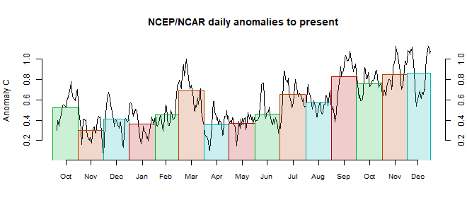
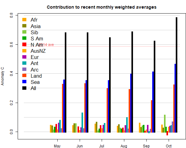
The TempLS mesh anomaly (1961-90 base) was 0.623deg;C in November vs 0.784°C in October. That reverses the warming last month, making it the coolest November since 2014. The NCEP/NCAR index also fell by 0.122°C, while the UAH satellite TLT index rose 0.06°C. The reanalysis showed most of the surface fall was in a cold spell mid-month.
The main cold region was N America (except west coast/Alaska), extending up through the Arctic archipelago. Elsewhere Europe was warm, extending into Africa. Also Alaska/E Siberia.
Here (from here) is the plot of relative contributions to the rise (ie components weighted by area):
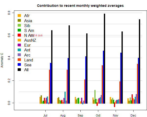
Here is the temperature map. As always, there is a more detailed active sphere map here.
The main cold region was N America (except west coast/Alaska), extending up through the Arctic archipelago. Elsewhere Europe was warm, extending into Africa. Also Alaska/E Siberia.
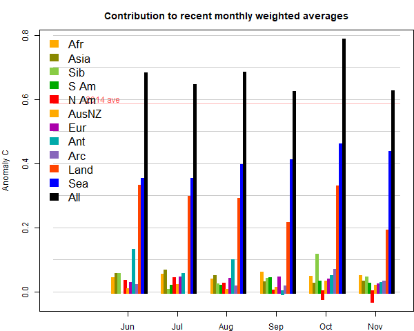
Here (from here) is the plot of relative contributions to the rise (ie components weighted by area):
Here is the temperature map. As always, there is a more detailed active sphere map here.
Monday, December 3, 2018
November NCEP/NCAR global surface anomaly down 0.122°C from October
In the Moyhu NCEP/NCAR index, the monthly reanalysis anomaly average was 0.176°C in November, down from 0.298°C in October, 2018. The fall follows a slightly smaller rise in October, and makes November the coolest month since July 2015. The month started and ended fairly warm, but there was a deep dip mid-month.
The main cold region was N America, except W Coast, but extending right up through the Arctic Archipelago. There were warm patches over Alaska and far N Atlantic/Scandinavia. Cool over a lot of Russia, warm Africa. Antarctica mixed, but a lot of cold. A noticeable El Niño warm jet.
The BoM El Niño alert continues.
Friday, November 16, 2018
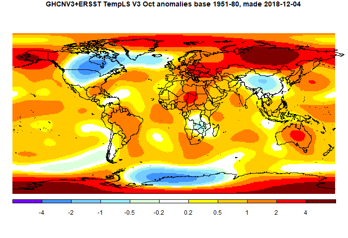
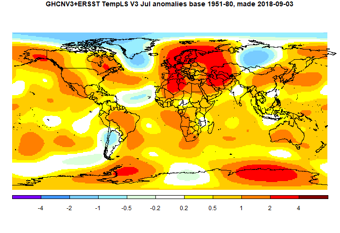
GISS October global up 0.25°C from September.
The GISS land/ocean temperature anomaly rose 0.29°C last month. The October anomaly average was 0.99°C, up from September 0.74°C. A big rise, exceeding the TempLS rise of 0.166°C. Like TempLS it was the second warmest October in the record, but it was even fairly close to the highest, the the El Nino value 0f 1.08 in 2015. Jim Hansen's report is here.
The overall pattern was similar to that in TempLS. Very warm in Siberia, but extending through the Arctic (which is probably why warmer than TempLS). Cold in Canada and US prairies. Quite warm in Europe, patchy in Antarctica.
As usual here, I will compare the GISS and previous TempLS plots below the jump.
Saturday, November 10, 2018
October global surface TempLS up 0.166°C from September.
The TempLS mesh anomaly (1961-90 base) was 0.786°C in October vs 0.62°C in September. That makes it the second warmest October in the record, after 2015. The NCEP/NCAR index also showed 0.1°C, while the UAH satellite TLT index rose 0.08°C. The reanalysis showed most of the rise in a pulse in the later part of the month.
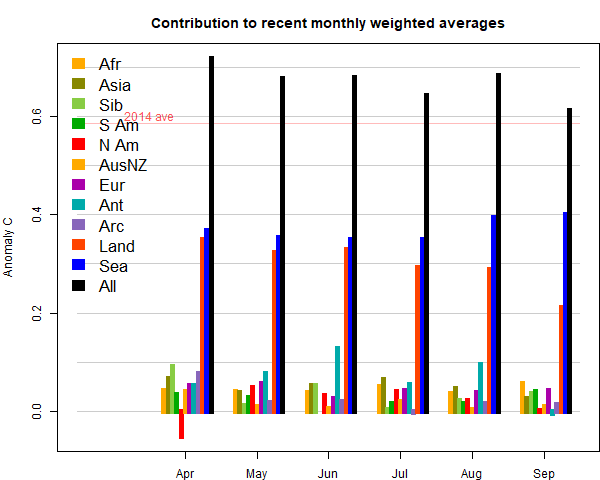
The marked feature for the last three months has been a big rise in SST, which continued. But this month land was also warm. The main hot spot was Siberia, whicle Canada/N US was cool. China was cool, Europe was warm. Here (from here) is the plot of relative contributions to the rise (ie components weighted by area):
Here is the temperature map. As always, there is a more detailed active sphere map here.
Saturday, November 3, 2018
October NCEP/NCAR global surface anomaly up 0.1°'C from September
In the Moyhu NCEP/NCAR index, the monthly reanalysis anomaly average was 0.298°C in October, up from 0.196°C in September, 2018. In the lower troposphere, UAH rose by 0.08°C. The Surface temperature had been drifting down since April, and October started on that trend, but a big rise in the second half made it the warmest month since April.
In fact, N America (especially Canada), China and W Europe were rather cool. The Arctic was warm, and E Europe; the Antarctic was patchy but mostly cool.
On El Niño from the BoM:
In fact, N America (especially Canada), China and W Europe were rather cool. The Arctic was warm, and E Europe; the Antarctic was patchy but mostly cool.
On El Niño from the BoM:
"The ENSO Outlook is set at El Niño ALERT. This means the chance of El Niño forming in 2018 is around 70%; triple the normal likelihood.
The tropical Pacific Ocean has warmed in recent weeks and is now just touching upon the El Niño threshold. Latest observations and model outlooks suggest further warming is likely, with most models indicating a transition to El Niño in November remains likely."
The tropical Pacific Ocean has warmed in recent weeks and is now just touching upon the El Niño threshold. Latest observations and model outlooks suggest further warming is likely, with most models indicating a transition to El Niño in November remains likely."
Friday, October 19, 2018
TempLS local anomalies posted - a data compression story.
I calculate and average global surface anomalies regularly, based on land data from GHCN V3 and sea surface from ERSST. I post the averages regularly here and post monthly reports. The program, TempLS, is described in summary here.
The essential steps are a least squares fitting of normals for each location and month, which are then subtracted from the observed temperatures to create station anomalies. These are then spatially integrated to provide a global average. The main providers who also to this do not generally post their local anomalies, but I have long wanted to do so. I have been discouraged by the size of the files, but I have recently been looking at getting better compression, with good results, so I will now post them.
packed$unpack(packed)
will cause a regular R list with the components described above to appear in your directory.
So I started looking at the structure of the data to see what was possible. There must be something, because the original GHCN files as gzipped ascii are about 12.7 MB, expanding to about 52 MB. The first thing to do is calculate the entropy, or Shannon information, using the formula
H = sum - pi log2(pi)
where p is the frequency of occurrence of each anomaly value. If I do that for the whole matrix, I get 4.51 bits per entry. That is, it should be possible to store the matrix in
1.57e+7 * 4.51/8 = 8.85 MB
But about 1/3 of the data are NA, mostly reflecting missing years, and this distorts the matter somewhat. There are 1.0e+7 actual numbers, and for these the entropy is 5.59 bits per entry. IOW, with NA's removed, about 7 MB should be needed.
That is a lot less than we are getting. The entropy is based on the assumption that all we know is the distribution. But there is also internal structure, autocorrelation, which could be used to predict and so lower the entropy. This should show up if we store differences.
That can be done in two ways. I looked first at time correlation, so differencing along rows. That reduced the entropy to only 5.51 (from 5.59). More interesting is differencing columns. GHCN does a fairly good job of listing stations with nearby stations close in the list, so this in effect uses a near station as a predictor. So differencing along columns reduces the entropy to 4.87 bits/entry, which is promising.
I'll describe below a bisection scheme. Whenever you divide, you have to store data to show how you did it, which is a significant cost. For dividing into two groups, the natural storage is a string of bits, one for each datum. So why bisection? It maximises the uncertainty. Without other information, each bit has an equal chance of being 1 or 0.
I should mention here too that, while probability ideas are useful, it is actually a deterministic problem. We want to find a minimal set of numbers which will describe another known set of numbers.
One could stop there. But I wanted to see how close to theoretical I could get. I'll put details below the jump, but the next step is to try to separate the more common occurrences. I list the numbers in decreasing order of occurrence, and see how many of the most common ones make up half the total. there were 11. So I use up one bit per number to mark the dividion into two groups, either in or out of that 11. So I have spent a bit, but now that 5 million (of the 10m) can be indexed to that set and expressed to the base 11. We can fit 9 of those into an unsigned 32 bit integer. So although the other set, with 349 numbers, will stil require the same space for each, half have gone from 10.3 bit's each to 3.55 bits each. So we're ahead, even after using one bit for indexing.
The yellow comes from a similar subdivision of the remainder. It includes a quarter of the total data, and also has a range of about 11 values (it doesn't matter that they are not consecutive)
And so on. I have shown in purple what remains after four subdivisions. It has only 1/16 of the data, but a range that is maybe not much less than the original range. So that may need 10 bits or so per element, but for the rest, they are expressed with about 3 bits (3.6). So instead of 10 bits originally, we have
2 bits used for marking, + 15/16 * 3.6 bits used for data + 1/16*10 for remainder
which is about 6 bits. Further subdivision would get it down toward 5.6
The halving maximises entropy of the binary lists. And the subgroups that are stored, from the centre out, are OK to store, because there is little variation in the occurrence of their values. The first is from the top of the distribution, and although the smaller rectangles are from regions of greater slope in the histogram, they are short intervals and the difference isn't worth chasing.
After differencing, the range is only 3 (-1,0,1), so the bisection scheme described above won't get far. So it is best to first use the radix compression. To base three, the numbers can be packed 20 at a time into 32 bit integers. And the zeroes are so prevalent that even those aggregated numbers are zero more than half the time. So even the first stage of the bisection process is very effective, since it reduced the data by half, and the smaller set, being only zero, needs no bits to distinguish the data. Overall, the upshot is a factor of compression of about 5. IOW, it costs only about 0.2 bits per data point to rempve NA's and reduce the data by 33%.
A bisection scheme successively removing the numbers occurring most frequently that account for half the remaining data, recovers almost all of that difference. A further improvement is made by differencing by columns (spatially). Missing values can be treated separately in a way that exploits their tendency to run in consecutive blocks in time.
Update I should summarize the final compression numbers. The compressed file with inventory and normals was 6.944 MB. But with the anomalies only, it is 6.619 MB, which is about 3.37 bits/matrix element. It beats the theoretical because it made additional use of differencing, exploiting the spatial autocorrelation, and efficiently dealt with NA's. Per actual number in the data, it is about 5.3 bits/number.
The essential steps are a least squares fitting of normals for each location and month, which are then subtracted from the observed temperatures to create station anomalies. These are then spatially integrated to provide a global average. The main providers who also to this do not generally post their local anomalies, but I have long wanted to do so. I have been discouraged by the size of the files, but I have recently been looking at getting better compression, with good results, so I will now post them.
The download file
The program is written in R, and so I post the data as a R data file. The main reason is that I store the data as a very big matrix. The file to download is here. It is a file of about 6.9 MBytes, and contains:- A matrix of 10989 locations x 1428 months, being months from Jan 1900 to Sep 2018. The entries are anomalies to 1 decimal place normalised to a base of 1961-90.
- A 10989x12 array of monthly normals. These are not actually the averages for those years, but are least squares fitted and then normalised so the global average of anomalies comes to zero over those years. Details here. You can of course regenerate the original temperature data by adding the anomalies to the appropriate normals.
- A set of 1428 global monthly global averages.
- An inventory of locations. The first 7280 are from the GHCN inventory, and give latitude, longitude and names. The rest are a subset of the 2x2° ERSST grid - the selection is explained here.
- A program to unpack it all, called unpack()
packed$unpack(packed)
will cause a regular R list with the components described above to appear in your directory.
Compression issues and entropy
The back-story to the compression issue is this. I found that when I made and saved (with gzip) an ordinary R list with just the anomalies, it was a 77 MByte file. R allows various compression options, but the best I could do was 52 MB, using "zx" at level 9. I could get some further improvement using R integer type, but that is a bit tricky, since R only supports 32 bit integers, and anyway it didn't help much. That is really quite bad, because there are 15.7 million anomalies, which can be set as integers of up to a few hundred. And it is using, with gzip, about 35 bits per number. I also tried netCDF via ncdf4, using the data type "short" which sounded promising, and compression level 9. But that still came ot 47 MB.So I started looking at the structure of the data to see what was possible. There must be something, because the original GHCN files as gzipped ascii are about 12.7 MB, expanding to about 52 MB. The first thing to do is calculate the entropy, or Shannon information, using the formula
H = sum - pi log2(pi)
where p is the frequency of occurrence of each anomaly value. If I do that for the whole matrix, I get 4.51 bits per entry. That is, it should be possible to store the matrix in
1.57e+7 * 4.51/8 = 8.85 MB
But about 1/3 of the data are NA, mostly reflecting missing years, and this distorts the matter somewhat. There are 1.0e+7 actual numbers, and for these the entropy is 5.59 bits per entry. IOW, with NA's removed, about 7 MB should be needed.
That is a lot less than we are getting. The entropy is based on the assumption that all we know is the distribution. But there is also internal structure, autocorrelation, which could be used to predict and so lower the entropy. This should show up if we store differences.
That can be done in two ways. I looked first at time correlation, so differencing along rows. That reduced the entropy to only 5.51 (from 5.59). More interesting is differencing columns. GHCN does a fairly good job of listing stations with nearby stations close in the list, so this in effect uses a near station as a predictor. So differencing along columns reduces the entropy to 4.87 bits/entry, which is promising.
More thoughts on entropy
Entropy here is related to information, which sounds like a good thing. It's often equated to disorder, which sounds bad. In its disorder guise, it is famously hard to get rid of. In this application, we can say that we get rid of it when we decide to store numbers, and the amount of storage is the cost. So the strategic idea is to make sure every number stored carries with it as much entropy as possible. IOW, it should be as unpredictable as possible. I sought to show this with the twelve coin problem. That is considered difficult, but is easily solved if you ensure every weighing has a maximally uncertain outcome.I'll describe below a bisection scheme. Whenever you divide, you have to store data to show how you did it, which is a significant cost. For dividing into two groups, the natural storage is a string of bits, one for each datum. So why bisection? It maximises the uncertainty. Without other information, each bit has an equal chance of being 1 or 0.
I should mention here too that, while probability ideas are useful, it is actually a deterministic problem. We want to find a minimal set of numbers which will describe another known set of numbers.
Radix compression
The main compression tool is to pack several of these anomalies into a 32 or 64 bit integer. There are just 360 numbers that occur, so if I list them with indices 0..359, I can treat 3 as digits of a base 360 number. 360^3 is about 4.66e+7, which can easily be expressed as a 32 bit integer. So each number is then using about 10.66 bits.One could stop there. But I wanted to see how close to theoretical I could get. I'll put details below the jump, but the next step is to try to separate the more common occurrences. I list the numbers in decreasing order of occurrence, and see how many of the most common ones make up half the total. there were 11. So I use up one bit per number to mark the dividion into two groups, either in or out of that 11. So I have spent a bit, but now that 5 million (of the 10m) can be indexed to that set and expressed to the base 11. We can fit 9 of those into an unsigned 32 bit integer. So although the other set, with 349 numbers, will stil require the same space for each, half have gone from 10.3 bit's each to 3.55 bits each. So we're ahead, even after using one bit for indexing.
Continuing with bisection
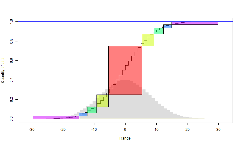
We can continue to bisect the larger set. There will again be a penalty of one bit per data point, in that smaller set. Since it halves each time, the penalty is capped at 2 bits overall for the data. The following diagram illustrates how it works. I have assumed that the anomalies, rendered as integers, are normally distributed, with the histogram in faint grey. The sigmoid is the cumulative sum of the histogram. So in the first step, the red block is chosen (it should align with the steps). The y axis shows the fraction of all data that it includes (about half). The x axis shows the range, in integer steps. So there are about 11 integers. That can be represented with a little over 3 bits per point.The yellow comes from a similar subdivision of the remainder. It includes a quarter of the total data, and also has a range of about 11 values (it doesn't matter that they are not consecutive)
And so on. I have shown in purple what remains after four subdivisions. It has only 1/16 of the data, but a range that is maybe not much less than the original range. So that may need 10 bits or so per element, but for the rest, they are expressed with about 3 bits (3.6). So instead of 10 bits originally, we have
2 bits used for marking, + 15/16 * 3.6 bits used for data + 1/16*10 for remainder
which is about 6 bits. Further subdivision would get it down toward 5.6
Update I have plotted a budget of how it actually worked out, for the points with NA removed and differenced as described next. . The Y axis is the number of 32 bit integers stored per data point. Default would be 1, and I have shown in light blue the level that we would get with simple packing. The X-axis is number of data, so the area is the total integers packed. The other columns are the results of the bisection. The red is the integers actually packed for the values in that set, and the green is the number of bits to mark the divisions, attributed between the set in each division. There were six divisions.
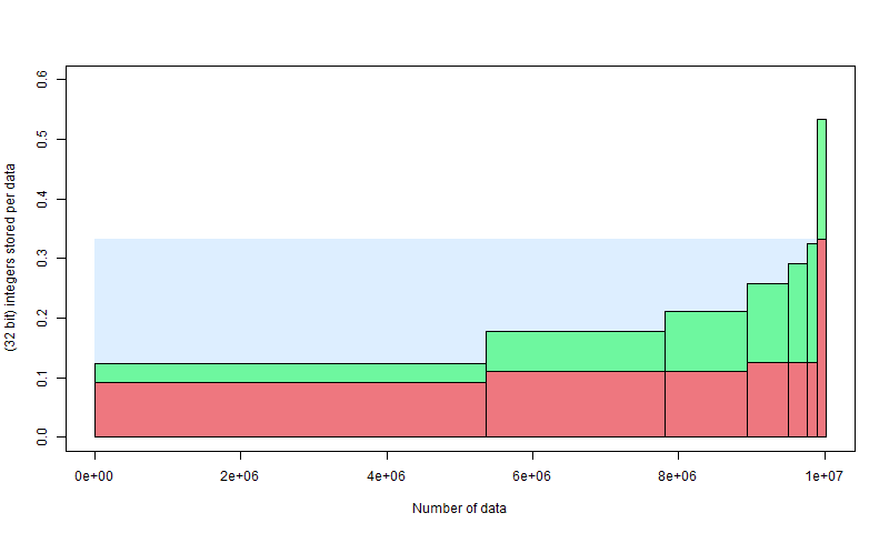
Although this suggests that dividing beyond 6 is not worthwhile, it is, because it still adds just one bit while substantially reducing half the remaining red.
Differencing
As said earlier, there is a significant saving if the data is differenced in columns - ie in spatial order. In practice, I just difference the whole set, in column order. The bottom of one column doesn't predict the top of the next, but it only requires that we can predict well on average.Strategy
You can think of the algorithm as successively storing groups of numbers which will allow reconstruction until there are none left. First a binary list for the first division is stored (in 32 bit integers), then numbers for the first subgroup, and so forth. The strategy is to make sure each has maximum entropy. Otherwise it would be marked for further compression.The halving maximises entropy of the binary lists. And the subgroups that are stored, from the centre out, are OK to store, because there is little variation in the occurrence of their values. The first is from the top of the distribution, and although the smaller rectangles are from regions of greater slope in the histogram, they are short intervals and the difference isn't worth chasing.
Missing values
I mentioned that about a third of the data, when arranged in this big matrix, are missing. The compression I have described actually does not require the data to be even integers, let alone consecutive, so the NA's could be treated as just another data point. However, I treat them separately for a reason. There is a penalty again of one bit set aside to mark the NA locations. But this time, that can be compressed. The reason is that in time, NA's are highly aggregated. Whether you got a reading this month is well predicted by last month. So the bit stream can be differenced, and there will be relatively few non-zero values. But that requires differencing by rows rather than columns, hence the desirability of separate treatment.After differencing, the range is only 3 (-1,0,1), so the bisection scheme described above won't get far. So it is best to first use the radix compression. To base three, the numbers can be packed 20 at a time into 32 bit integers. And the zeroes are so prevalent that even those aggregated numbers are zero more than half the time. So even the first stage of the bisection process is very effective, since it reduced the data by half, and the smaller set, being only zero, needs no bits to distinguish the data. Overall, the upshot is a factor of compression of about 5. IOW, it costs only about 0.2 bits per data point to rempve NA's and reduce the data by 33%.
Summary
I began with an array providing for 15 million anomalies, of which 5 million were missing. Conventional R storage, including compression, used about 32 bits per datum, not much better than 32 bit integers. Simple radix packing, 3 to a 32 bit integer, gives a factor of 3 improvement, to about 10.7 bits/datum. But analysis of entropy says only about 5.6 bits are needed.A bisection scheme successively removing the numbers occurring most frequently that account for half the remaining data, recovers almost all of that difference. A further improvement is made by differencing by columns (spatially). Missing values can be treated separately in a way that exploits their tendency to run in consecutive blocks in time.
Update I should summarize the final compression numbers. The compressed file with inventory and normals was 6.944 MB. But with the anomalies only, it is 6.619 MB, which is about 3.37 bits/matrix element. It beats the theoretical because it made additional use of differencing, exploiting the spatial autocorrelation, and efficiently dealt with NA's. Per actual number in the data, it is about 5.3 bits/number.
Appendix - some details.
Thursday, October 18, 2018
GISS September global down 0.02°C from August.
The GISS land/ocean temperature anomaly fell 0.02°C last month. The September anomaly average was 0.75°C, down from August 0.77°C. It seems to be the sixth warmest September in the record, or, to put it another way, the coolest since 2012 (but warmer or as warm as any September before that). TempLS declined more;, by 0.075. Late data brought it down from my original report Jim Hansen's report is here.
The overall pattern was similar to that in TempLS. Warm in Europe, especially NW Russia and extending into Arabia and NE Africa. .Also warm in eastern US and Alaska, but cold in N Canada. . Cool spots in S Brazil and S Africa. Patchy but cool in Antarctica
As usual here, I will compare the GISS and previous TempLS plots below the jump.
Monday, October 8, 2018
September global surface TempLS unchanged from August.
As of today, it shows a fall of 0.002°C, but the sign of that could easily change. The TempLS mesh anomaly (1961-90 base) was 0.682°C in September vs 0.684°C in August. The NCEP/NCAR index also showed virtually no change, while the UAH satellite TLT index declined (0.05°C).
The marked feature was a big rise in SST, balanced by a cooling on land, especially in N Canada. There was a band of warmth from NW Russia through Europe into Africa. Antarctica was cold. Here (from here) is the plot of relative contributions to the rise (ie components weighted by area). Note, as mentioned above, the strong effect of the SST rise on the global average:
Here is the temperature map. As always, there is a more detailed active sphere map here.
Thursday, October 4, 2018
Cooling tracks of Hurricane Florence.
Back in early 2013, I posted some animations showing various hurricanes from 2012 and earlier superimposed on a high resolution (1/4 degree) map of sea surface temperature (such as you can see here). I've just realised that Hurricane Florence shows this particularly well. The movie of the last 50 days is here. Here are some stills:
Wednesday, October 3, 2018
September NCEP/NCAR global surface anomaly unchanged from August
In the Moyhu NCEP/NCAR index, the monthly reanalysis anomaly average was 0.196°C in September, similar to 0.194°C in August, 2018. In the lower troposphere, UAH fell by 0.05°C.
There were few prominent patterns in the month, and no big ups and downs. Cold in Antarctica and N Canada. Warm in Alaska and the Arctic above Siberia, extending weakly through Europe.
BoM is still on El Niño Watch, meaning about a 50% chance, they say, but nothing yet.
There were few prominent patterns in the month, and no big ups and downs. Cold in Antarctica and N Canada. Warm in Alaska and the Arctic above Siberia, extending weakly through Europe.
BoM is still on El Niño Watch, meaning about a 50% chance, they say, but nothing yet.
Tuesday, September 18, 2018
GISS August global down 0.01°C from July.
The GISS land/ocean temperature anomaly fell 0.01°C last month. The August anomaly average was 0.77°C, down from July 0.78°C. For the second month, the GISS report is not listed at the news page. It seems to be the fifth warmest August in the record, or, to put it another way, the coolest since 2013 (but warmer than any August before that). In some contrast TempLS rose 0.03°, but the changes are small. Satellite indices both fell considerably. In the last two months, satellite TLT rose and fell by about the same amount, while changes at surface were small.
The overall pattern was similar to that in TempLS. Very warm in Europe, extending to Siberia and NE Africa. .Also warm in N America, West coast and acean and NE. Cool spots in S Brazil and S Africa.
As usual here, I will compare the GISS and previous TempLS plots below the jump.
Update I see that James Hansen and Makiko Sato have been issuing regular monthly reports as the GISS numbers are posted. The current one is here. There is a list of past reports here, where you can ask to get them by email.
The overall pattern was similar to that in TempLS. Very warm in Europe, extending to Siberia and NE Africa. .Also warm in N America, West coast and acean and NE. Cool spots in S Brazil and S Africa.
As usual here, I will compare the GISS and previous TempLS plots below the jump.
Saturday, September 8, 2018
August global surface TempLS up 0.032 °C from July.
The TempLS mesh anomaly (1961-90 base) rose a little, from 0.641°C in July to 0.673°C in August. This is opposite to the 0.067°C fall in the NCEP/NCAR index, while the UAH satellite TLT index declined more (0.13°C). There may be a reason for that discrepancy, which happened in the opposite direction last month. Although the land temperatures went down a little, SST went up, by about 0.04°C, which is quite a big month change for SST. It makes it warmest since last November, and could be the first sign of a coming El Niño influence. The reanalysis and troposphere measures do not use SST directly.
As with the reanalysis, there were few prominent patterns in the month. Cool in parts of S America, N Canada, and a large region of A Australia and adjacent ocean. Still warm in E Europe and far N Siberia, and NE USA. Antarctica was the only notably warm place (relatively). Here (from here) is the plot of relative contributions to the rise (ie components weighted by area). Note, as mentioned above, the strong effect of the SST rise on the global average:
Here is the temperature map. As always, there is a more detailed active sphere map here.
Monday, September 3, 2018
August NCEP/NCAR global surface anomaly down by 0.067°C from July
In the Moyhu NCEP/NCAR index, the monthly reanalysis anomaly average fell from 0.261°C in July to 0.194°C in August, 2018. This is a slightly greater drop than the previous month's rise, and so makes August the coldest month since July 2015 in this surface re cord. In the lower troposphere, UAH also fell by a little more, 0.13°C, than the previous month's rise.
There were few prominent patterns in the month. Cold in parts of S America, N Canada, and a large region of W Australia and adjacent ocean. Still warm in E Europe and far N Siberia, and NE USA. Contrasts in Antarctica.
BoM is still on El Niño Watch, meaning about a 50% chance, they say, but not yet happening.
Arctic Ice seems to have thawed slowly lately, with a likely September minimum about average for recent years.
Friday, August 17, 2018
GISS July global up 0.01°C from June.
The GISS land/ocean temperature anomaly rose 0.01°C last month. The July anomaly average was 0.78°C, up from June 0.77°C. The GISS report does not seem to be posted yet, or at least is not linked from their news page, but the gist is at Axios. It notes that it is the third warmest July in the record. The small rise contrasts with the downward TempLS, but the NCEP/NCAR index rose a little more. Satellite indices both rose considerably. The disagreement between GISS and TempLS is the opposite of last month, so little difference over two months.
The overall pattern was similar to that in TempLS. Very warm in Europe, extending to W Siberia and N Africa. .Also warm in N America, West coast and NE. Rather cold in Argentina and Arctic.
As usual here, I will compare the GISS and previous TempLS plots below the jump.
The overall pattern was similar to that in TempLS. Very warm in Europe, extending to W Siberia and N Africa. .Also warm in N America, West coast and NE. Rather cold in Argentina and Arctic.
As usual here, I will compare the GISS and previous TempLS plots below the jump.
Tuesday, August 14, 2018
July global surface TempLS down 0.045 °C from June.
The TempLS mesh anomaly (1961-90 base) fell a little, from 0.680°C in June to 0.635°C in July. This is opposite to the 0.052°C rise in the NCEP/NCAR index, while the UAH satellite TLT index rose more (0.11°C).
The post is late again this month, and for the same odd reason. Australia submitted a CLIMAT form with about 1/3 the right number of stations, mostly SE coast. Kazakhstan, Peru were late too, but Australia is the big one. That data still isn't in. I've modified the map in the TempLS report to show the stations that reported last month (but not this) in a pale blue to show what is missing.
There were some noted heat waves, but relatively restricted in space and time. There was a big blob of heat covering Europe, N Africa and up to W Siberia. Mid Siberia was cold, as was Greenland and nearby sea, and Argentina. Arctic was cool, Antarctic warmer. N America was warm, especially W Coast and Quebec. SSTs continued rising overall.
Here is the temperature map. As always, there is a more detailed active sphere map here.
Friday, August 3, 2018
July NCEP/NCAR global surface anomaly up by 0.052°C from June
In the Moyhu NCEP/NCAR index, the monthly reanalysis anomaly average rose from 0.209°C in June to 0.261°C in July, 2018. June was cold by recent standards, so that is a modest recovery. In the lower troposphere, UAH rose more, by 0.11°C.
Notably, there were heat waves in W and N Europe, extending in a band through Russia, and into N Sahara. Parts of W and E North America were also hot, but unevenly so. Cool areas in S America and Southern Africa, and Central Siberia. The Arctic was mixed, with some cold, and the Antarctic even more so.
BoM is on El Niño Watch, meaning about a 50% chance, they say, but nothing yet.
Arctic Ice seems to have thawed rapidly lately, but there may be recent artefacts. JAXA has been irregular.
Tuesday, July 17, 2018
GISS June global down 0.06°C from May.
The GISS land/ocean temperature anomaly fell 0.06°C last month. The June anomaly average was 0.77°C, down from May 0.83°C. The GISS report notes that it is the equal third warmest June in the record. The decline contrasts with the virtually unchanged TempLS; the NCEP/NCAR index declined a little more. Satellite indices both rose a little.
The overall pattern was similar to that in TempLS. Very warm in N Central Siberia and Antarctica. Warm in most of N America, and also in Europe and Middle East. Rather cold in S America and Arctic.
As usual here, I will compare the GISS and previous TempLS plots below the jump.
The overall pattern was similar to that in TempLS. Very warm in N Central Siberia and Antarctica. Warm in most of N America, and also in Europe and Middle East. Rather cold in S America and Arctic.
As usual here, I will compare the GISS and previous TempLS plots below the jump.
Wednesday, July 11, 2018
Extended portal to the BoM station data.
I maintain a page of portals to various climate datasets, which sometimes just has a link, and sometimes something more active, giving what I think is more convenient access. The Australian Bureau of Meteorology has a large amount of well organised data on its site. There is a lot that you can get to via the Climate Data Online page. There is also station metadata, which I had previously made an access frame on the page. This is now extended, to gather together as much station data as I can in one place. So that includes metadata, station climate statistics, and detailed records of monthly average maxima (TMax) and minima (Tmin), and corresponding daily data. BoM does not provide Tmax+Tmin averages.
There are various notions of station here. BoM actually has a huge set, but many have rainfall data only, and those are omitted here. There is a subset that have AWS, and post data in a different way, to which I provide a separate portal button. Then there is the ACORN set, which is a set of 110 well maintained and documented stations, for which the data has been carefully homogenised. It starts in 1910. BoM seems proud of this, and the resulting publicity has led some to think that is all they offer. There is much more.
I've tried to provide the minimum of short cuts so that the relevant further choices can be made in the BoM environment. For example, asking for daily data will give a single year, but then you can choose other years. You can also, via BoM, download datafiles for individual stations, daily for all years, or in other combinations.
The BoM pages are very good for looking up single data points. They are not so good if you want to analyse data from many stations. Fortunately, all the data is also on GHCN Daily, for which I have a portal on the same page. It takes a while to get on top of their system - firstly generating the station codes, and then deciphering the bulky text file format. But it's there.
For the new portal, the top of the table looks like this:

If you click on the red-ringed button, it shows this:
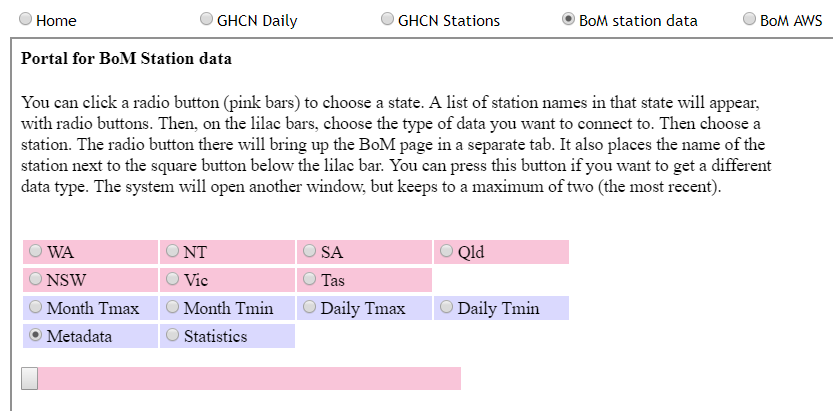
To get started, you need to choose a state. Then a list of stations, each with a radio button, will appear below. Then, from the lilac bar, you should choose a data type, eg daily Tmax. Then you can click on a station button. Your selection will appear in a new tab to which your browser takes you. From there you can makes further choices in the BoM system.
Your station choice will also appear beside the square button below the lilac (and above the stations). This button now has the same functionality as the station button below, so you don't have to scroll down to make new data choices. You can indeed make further data choices. These will make new tabs, to facilitate comparisons, but up to a max of the two most recent.
There are various notions of station here. BoM actually has a huge set, but many have rainfall data only, and those are omitted here. There is a subset that have AWS, and post data in a different way, to which I provide a separate portal button. Then there is the ACORN set, which is a set of 110 well maintained and documented stations, for which the data has been carefully homogenised. It starts in 1910. BoM seems proud of this, and the resulting publicity has led some to think that is all they offer. There is much more.
I've tried to provide the minimum of short cuts so that the relevant further choices can be made in the BoM environment. For example, asking for daily data will give a single year, but then you can choose other years. You can also, via BoM, download datafiles for individual stations, daily for all years, or in other combinations.
The BoM pages are very good for looking up single data points. They are not so good if you want to analyse data from many stations. Fortunately, all the data is also on GHCN Daily, for which I have a portal on the same page. It takes a while to get on top of their system - firstly generating the station codes, and then deciphering the bulky text file format. But it's there.
For the new portal, the top of the table looks like this:
If you click on the red-ringed button, it shows this:
To get started, you need to choose a state. Then a list of stations, each with a radio button, will appear below. Then, from the lilac bar, you should choose a data type, eg daily Tmax. Then you can click on a station button. Your selection will appear in a new tab to which your browser takes you. From there you can makes further choices in the BoM system.
Your station choice will also appear beside the square button below the lilac (and above the stations). This button now has the same functionality as the station button below, so you don't have to scroll down to make new data choices. You can indeed make further data choices. These will make new tabs, to facilitate comparisons, but up to a max of the two most recent.
Tuesday, July 10, 2018
WUWT and heat records.
I'm on the outer again at WUWT (update - seems OK now). The issue is recent heat records, which WUWT wants to challenge because of alleged inadequacies in the stations. Not that the thermometers were inaccurate, but that the environment was not representative of climate. My contention was that this was only relevant to climate science if scientists were using them as representative of climate, and for most of the stations at issue, they weren't.
Since I did quite a bit of reading about it, I thought I would set down the issues here. The basic point is that there are a large number of thermometers around the world, trying to measure the environment for various purposes. Few now are primarily for climate science, and even fewer historically. But they contain a lot of information, and it is the task of climate scientists to select stations that do contain useful climate information. The main mechanism for doing this is the archiving that produces the GHCN V3 set. People at WUWT usually attribute this to NASA GISS, because they provide a handy interface, but it is GHCN who select the data. For current data they rely on the WMO CLIMAT process, whereby nations submit data from what they and WMO think are their best stations. It is this data that GISS and NOAA use in their indices. The UKMO use a similar selection with CRUTEM, for their HADCRUT index.
At WUWT, AW's repeated complaint was that I don't care about accuracy in data collection (and am a paid troll, etc). That is of course not true. I spend a lot of time, as readers here would know, trying to get temperature and its integration right. But the key thing about accuracy is, what do you need to know? The post linked above pointed to airports where the sensor was close to the runways. This could indeed be a problem for climate records, but it is appropriate for their purpose, which is indeed to estimate runway temperature. The key thing here is that those airport stations are not in GHCN, and are not used by climate scientists. They are right for one task, and not used for the other.
I first encountered this WUWT insistence that any measurement of air temperature had to comply with climate science requirements, even if it was never used for CS, in this post on supposed NIWA data adjustments in Wellington. A station was pictured and slammed for being on a rooftop next to air conditioners. In fact the sataion was on a NIWA building in Auckland, but more to the point, it was actually an air quality monitoring station, run by the Auckland municipality. But apparently the fact that it had no relation to climate, or even weather, did not matter. That was actually the first complaint that I was indifferent to the quality of meteorological data.
A repeated wish at WUWT was that these stations should somehow be disqualified from record considerations. I repeatedly tried to get some meaning attached to that. A station record is just a string of numbers, and there will be a maximum. Anyone who has access to the numbers can work it out. So you either have to suppress the numbers, or allow that people may declare that a record has been reached. And with airport data, for example, you probably can't suppress the numbers, even if you wanted. They are measured for safety etc, and a lot of people probably rely on finding them on line.
Another thing to say about records is that, if rejected, the previous record stands. And it may have no better provenance than the one rejected. WUWT folk are rather attached to old records. Personally, I don't think high/low records are a good measure at all, since they are very vulnerable to error. Averages are much better. I think the US emphasis on daily records is regrettable.
The first two posts in the WUWT series were somewhat different, being regional hot records . So I'll deal with them separately.
As might be feared, this led in comments to accusations of dishonesty and incompetence at the UKMO, even though they had initiated and reported the investigation. But one might well ask, how could it happen that that could happen at a UKMO station?
Well, the answer is that it isn't a UKMO station. As the MO blog explained, the MO runs: "a network comprised of approximately 259 automatic weather stations managed by Met Office and a further 160 manual climate stations maintained in collaboration with partner organisations and volunteer observers" Motherwell is a manual station. It belongs to a partner organisation or volunteers (the MO helps maintain it). They have a scheme for this here. You can see there that the site has a rating of one star (out of five), and under site details, in response to the item "Reason for running the site" says, Education. (Not, I think, climate science).
So Motherwell is right down the bottom of the 400+ British stations. Needless to say, it is not in GHCN or CRUTEM, and is unlikely to ever be used by a climate scientist, at least for country-sized regional estimates.
So to disqualify? As I said above, you can only do this by suppressing the data, since people can work out for themselves if it beats the record. But the data has a purpose. It tells the people of Motherwell the temperature in their town, and it seems wrong to refuse to tell them because of its inadequacy for the purposes of climate science, which it will never be required to fulfil.
The WUWT answer to this is, but it was allowed to be seen as a setter of a record for Scotland. I don't actually think the world pays a lot of attention to that statistic, but anyway, I think the MO has the right solution. Post the data as usual (it's that or scrub the site), and if a record is claimed, vet the claim. They did that, rejected it, and that was reported and respected.
But "potentially bogus" is what they would call a weasel word. In fact, all that is known is that the site is an airport (not highly trafficked). There is speculation on where the sensor is located, and no evidence that any particular aircraft might have caused a perturbation. The speculated location is below (red ring).
It is actually 92m from the nearest airport tarmac, and 132 m from the nearest black rectangle, which are spaces where an aircraft might actually be parked. It seems to me that that is quite a long way (It is nearly 400 m to the actual runway), and if one was to be picky, the building at about 25m and the road at 38 m would be bigger problems. But these are not airport-specific problems.
A point this time is that Ouarglu is indeed a GHCN monthly station. For the reasons I have described, it does seem relatively well fitted for the role (assuming that the supposed location is correct).
But it is very odd to suggest that a station should be disqualified from expressing its own record high. That is just the maximum of those figures, so if you disqualify the record high, you must surely disqualify the station. But why only those that record a record high?
Anyway, the complaints came down to the following (click to enlarge):
There were also sites at UCLA and Santa Ana Fire Station, which were on rooftops. Now the first thing about these is that are frequently quoted local temperature sites, but apart from USC, none of them get into GHCN V3 currently (Burbank has data to 1966). So again, they aren't used for climate indices like GISS, NOSS or HADCRUT. But the fact that, whatever their faults, they are known to locals means that the record high, for that site, is meaningful to LA Times readership. And it is apparent from some of the WUWT comments that the suggestion that it was in fact very hot accords with their experience.
Again, the airport sites are clearly measuring what they want to measure - temperature on the runway. And climate scientists don't use them for that reason. UCLA seems to be there because it is next to an observatory. I don't know why the Fire Station needs a themometer on the roof, but I expect there is a reason.
As a general observation, I think it is a rather futile endeavour to try to suppress record highs on a generally hot day because of site objections. Once one has gone, another will step up. And while one record might conceivably be caused by, say, a chance encounter with a plane exhaust or aircon, it would be a remarkable coincidence for this to happen to tens of stations on the same day. Occam would agree that it was a very hot day, not a day when all the planes aligned.
Since I did quite a bit of reading about it, I thought I would set down the issues here. The basic point is that there are a large number of thermometers around the world, trying to measure the environment for various purposes. Few now are primarily for climate science, and even fewer historically. But they contain a lot of information, and it is the task of climate scientists to select stations that do contain useful climate information. The main mechanism for doing this is the archiving that produces the GHCN V3 set. People at WUWT usually attribute this to NASA GISS, because they provide a handy interface, but it is GHCN who select the data. For current data they rely on the WMO CLIMAT process, whereby nations submit data from what they and WMO think are their best stations. It is this data that GISS and NOAA use in their indices. The UKMO use a similar selection with CRUTEM, for their HADCRUT index.
At WUWT, AW's repeated complaint was that I don't care about accuracy in data collection (and am a paid troll, etc). That is of course not true. I spend a lot of time, as readers here would know, trying to get temperature and its integration right. But the key thing about accuracy is, what do you need to know? The post linked above pointed to airports where the sensor was close to the runways. This could indeed be a problem for climate records, but it is appropriate for their purpose, which is indeed to estimate runway temperature. The key thing here is that those airport stations are not in GHCN, and are not used by climate scientists. They are right for one task, and not used for the other.
I first encountered this WUWT insistence that any measurement of air temperature had to comply with climate science requirements, even if it was never used for CS, in this post on supposed NIWA data adjustments in Wellington. A station was pictured and slammed for being on a rooftop next to air conditioners. In fact the sataion was on a NIWA building in Auckland, but more to the point, it was actually an air quality monitoring station, run by the Auckland municipality. But apparently the fact that it had no relation to climate, or even weather, did not matter. That was actually the first complaint that I was indifferent to the quality of meteorological data.
A repeated wish at WUWT was that these stations should somehow be disqualified from record considerations. I repeatedly tried to get some meaning attached to that. A station record is just a string of numbers, and there will be a maximum. Anyone who has access to the numbers can work it out. So you either have to suppress the numbers, or allow that people may declare that a record has been reached. And with airport data, for example, you probably can't suppress the numbers, even if you wanted. They are measured for safety etc, and a lot of people probably rely on finding them on line.
Another thing to say about records is that, if rejected, the previous record stands. And it may have no better provenance than the one rejected. WUWT folk are rather attached to old records. Personally, I don't think high/low records are a good measure at all, since they are very vulnerable to error. Averages are much better. I think the US emphasis on daily records is regrettable.
The first two posts in the WUWT series were somewhat different, being regional hot records . So I'll deal with them separately.
Motherwell
The WUWT post is here, with a follow-up here. The story, reported by many news outlets, was briefly this. There was a hot day on June 28 in Britain, and Motherwell, near Glasgow, posted a temperature of 91.8°F, which seemed to be a record for Scotland. A few days later the UKMO, in a blog post, said that they had investigated this as a possible record, but rules it out because there was a parked vehicle with engine running (later revealed as an ice-cream truck) close by.As might be feared, this led in comments to accusations of dishonesty and incompetence at the UKMO, even though they had initiated and reported the investigation. But one might well ask, how could it happen that that could happen at a UKMO station?
Well, the answer is that it isn't a UKMO station. As the MO blog explained, the MO runs: "a network comprised of approximately 259 automatic weather stations managed by Met Office and a further 160 manual climate stations maintained in collaboration with partner organisations and volunteer observers" Motherwell is a manual station. It belongs to a partner organisation or volunteers (the MO helps maintain it). They have a scheme for this here. You can see there that the site has a rating of one star (out of five), and under site details, in response to the item "Reason for running the site" says, Education. (Not, I think, climate science).
So Motherwell is right down the bottom of the 400+ British stations. Needless to say, it is not in GHCN or CRUTEM, and is unlikely to ever be used by a climate scientist, at least for country-sized regional estimates.
So to disqualify? As I said above, you can only do this by suppressing the data, since people can work out for themselves if it beats the record. But the data has a purpose. It tells the people of Motherwell the temperature in their town, and it seems wrong to refuse to tell them because of its inadequacy for the purposes of climate science, which it will never be required to fulfil.
The WUWT answer to this is, but it was allowed to be seen as a setter of a record for Scotland. I don't actually think the world pays a lot of attention to that statistic, but anyway, I think the MO has the right solution. Post the data as usual (it's that or scrub the site), and if a record is claimed, vet the claim. They did that, rejected it, and that was reported and respected.
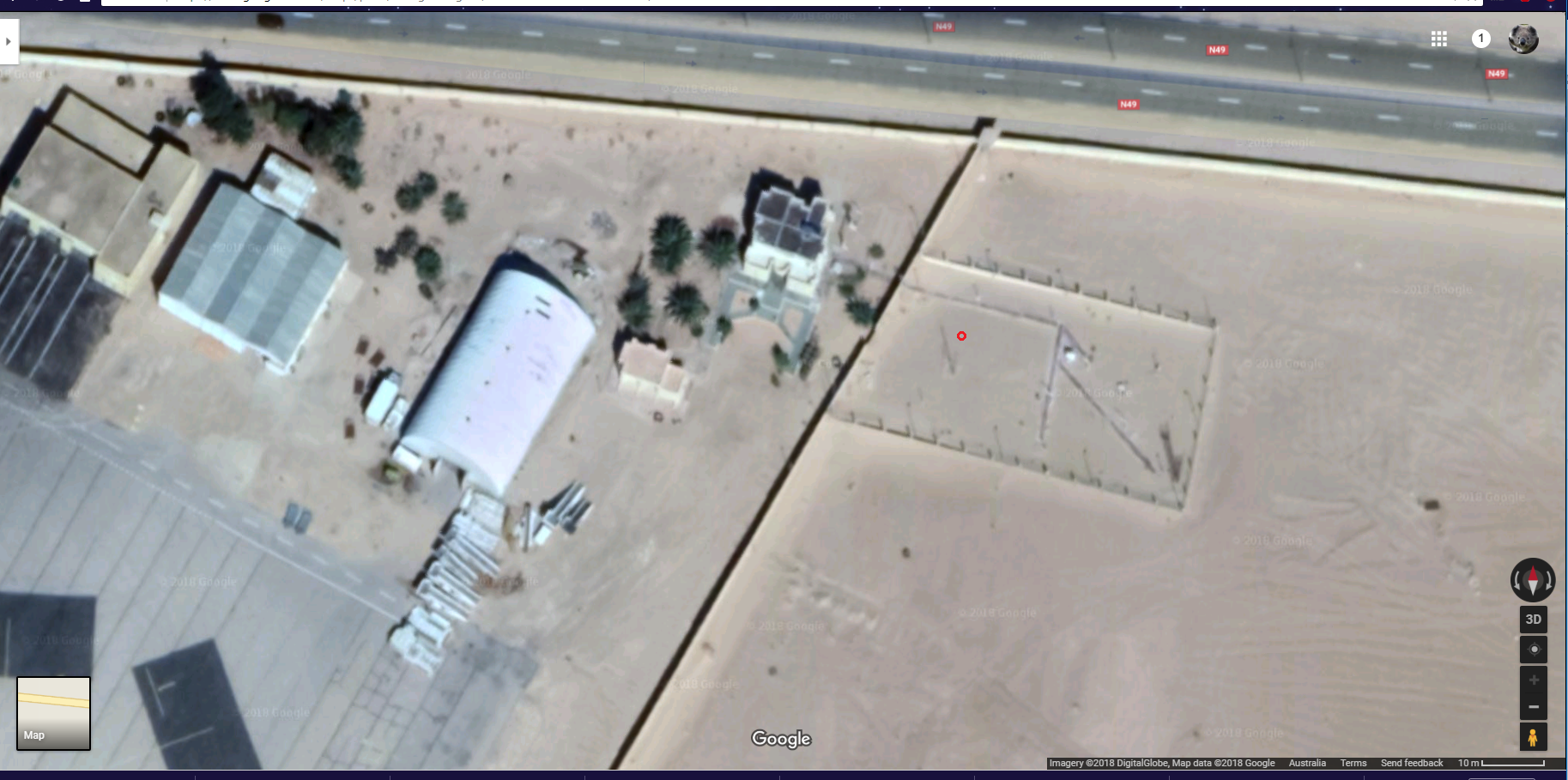
Ouarglu, Algeria
The WUWT post is here. On 5 July, this airport site posted a temperature of 124°F, said to be a record for Africa. There have been higher readings, but apparently considered unreliable. The WUWT heading was "Washington Post promotes another potentially bogus “all time high” temperature record"But "potentially bogus" is what they would call a weasel word. In fact, all that is known is that the site is an airport (not highly trafficked). There is speculation on where the sensor is located, and no evidence that any particular aircraft might have caused a perturbation. The speculated location is below (red ring).
It is actually 92m from the nearest airport tarmac, and 132 m from the nearest black rectangle, which are spaces where an aircraft might actually be parked. It seems to me that that is quite a long way (It is nearly 400 m to the actual runway), and if one was to be picky, the building at about 25m and the road at 38 m would be bigger problems. But these are not airport-specific problems.
A point this time is that Ouarglu is indeed a GHCN monthly station. For the reasons I have described, it does seem relatively well fitted for the role (assuming that the supposed location is correct).
Los Angeles
The final post (to now) was on high temperatures around Los Angeles on 6 and 7 July. Several places were said to have either reached their maximum ever, or the maximum ever for that day. The WUWT heading was "The all time record high temperatures for Los Angeles are the result of a faulty weather stations and should be disqualified"But it is very odd to suggest that a station should be disqualified from expressing its own record high. That is just the maximum of those figures, so if you disqualify the record high, you must surely disqualify the station. But why only those that record a record high?
Anyway, the complaints came down to the following (click to enlarge):
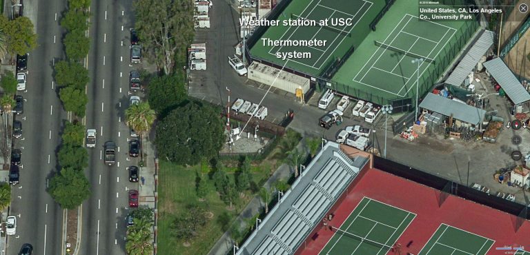 |  |  |  |
| USC | LA Power and Light | Van Nuys Airport | Burbank Airport |
There were also sites at UCLA and Santa Ana Fire Station, which were on rooftops. Now the first thing about these is that are frequently quoted local temperature sites, but apart from USC, none of them get into GHCN V3 currently (Burbank has data to 1966). So again, they aren't used for climate indices like GISS, NOSS or HADCRUT. But the fact that, whatever their faults, they are known to locals means that the record high, for that site, is meaningful to LA Times readership. And it is apparent from some of the WUWT comments that the suggestion that it was in fact very hot accords with their experience.
Again, the airport sites are clearly measuring what they want to measure - temperature on the runway. And climate scientists don't use them for that reason. UCLA seems to be there because it is next to an observatory. I don't know why the Fire Station needs a themometer on the roof, but I expect there is a reason.
As a general observation, I think it is a rather futile endeavour to try to suppress record highs on a generally hot day because of site objections. Once one has gone, another will step up. And while one record might conceivably be caused by, say, a chance encounter with a plane exhaust or aircon, it would be a remarkable coincidence for this to happen to tens of stations on the same day. Occam would agree that it was a very hot day, not a day when all the planes aligned.
Conclusion
People take the temperature of the air for various reasons, and there is no reason to think the measurement is inaccurate. The WUWT objection is that it is sometimes unrepresentative of local climate. The key question then is whether someone is actually trying to use it to represent local climate. They don't bother to answer that. The first place to look is whether it is included in GHCN. In most cases here, it isn't. Where it is, the stations seem quite reasonable.
June global surface TempLS up 0.015 °C from May.
The TempLS mesh anomaly (1961-90 base) rose a little, from 0.679°C in May to 0.694°C in June. This is opposite to the 0.078°C fall in the NCEP/NCAR index, while the UAH satellite TLT index rose by a similar amount (0.03°C).
I've been holding off posting this month because, although it didn't take long to reach an adequate number of stations, there are some sparse areas. Australia in particular has only a few stations reporting, and Canada seems light too. Kazakhstan, Peru and Colombia are late, but that is not unusual. It is a puzzle, because Australia seems to have sent in a complete CLIMAT form, as shown at Ogimet. But, as said, I think there are enough stations, and it seems there may not be more for a while.
It was very warm in central Siberia and Antarctica, and quite warm in Europe US and most of Africa. Cold in much of S America, and Quebec/Greenland (and ocean).
Here is the temperature map. As always, there is a more detailed active sphere map here.
Tuesday, July 3, 2018
June NCEP/NCAR global surface anomaly down by 0.078°C from May
In the Moyhu NCEP/NCAR index, the monthly reanalysis anomaly average fell from 0.287°C in May to 0.209°C in June, 2018. That follows a similar fall last month, and makes June now the coldest month since July 2015. In the lower troposphere, UAH rose 0.03°C.
It was warm in most of N America, but cold in Quebec and Greenland. Moderate to cool just about everywhere else, including the poles. Active map here.
The BoM still says that ENSO is neutral, but with chance of El Niño in the (SH) spring.
Arctic sea ice is a bit confused for now. Jaxa has been off the air for nearly two weeks, said to be computer issues, but NSIDC is also odd. Much discussion at Neven's of satellite troubles.
Update: No sooner said than JAXA has come back on. Nothing much to report; 2018 is not far behind, but quite a few recent years are ahead. NSIDC reported a big day melt, which might have been a catch-up.
Monday, July 2, 2018
Hansen's 1988 prediction scenarios - numbers and details.
There has been a great deal of blog posting on the thirtieth anniversary of James Hansen's famous Senate testimony on global warming, and the accompanying 1988 prediction paper. I reviewed a lot of this in my previous post and I have since been in a lot of blog arguments. I suppose this has run its course for the moment, but there may be another round in 2020, since Hansen's prediction actually went to 2019.
Anyway, for the record, I would like to set down some clarification of what the scenarios for the predictions actually were, and what to make of them. Some trouble has been caused by Hansen's descriptions, which were not always clear. This is exacerbated by readers who interpret in terms of modern much discussed knowledge of tonnage emissions of CO2. This is an outgrowth of the UNFCC in early 1990's getting governments to agree to collect data on that. Although there were estimates made before 1988, they were without benefit of this data collection, and Hansen did not use them at all. I don't know if he was aware of them, but he in any case preferred the much more reliable CO2 concentration figures.
"One idiosyncrasy that you have to watch in Hansen's descriptions is that he typically talks about growth rates forthe increment , rather than growth rates expressed in terms of the quantity. Thus a 1.5% growth rate in the CO2 increment yields a much lower growth rate than a 1.5% growth rate (as an unwary reader might interpret)."
Hansen is consistent though. His conventions are
I'll just briefly summarise some of the misconceptions I battle in blogs:
The basic arithmetic for Scenario A is that, if a1, a2, a3 are successive annual averages of CO2 ppm, then
(a3-a2)/(a2-a1) = 1.015
or the linear recurrence relation a3 = a2 +1.015*(a2 - a1)
There is an explicit solution of this for scen_2, which is the set Steve Mc calculated:
CO2 ppm = 235 + 117.1552*1.015^n where n is the number of years after 1988. That generates the dataset.
The formula for the actual Hansen set is slightly different. Oddly, the increment ratio is now not 1.015, but 1.0151131. This obviously makes little difference in practice; I think it arises from setting the monthly increment to 0.125% and compounding monthly. However
1.00125^12 = 1.015104 which is close but not exact. Perhaps there was some rounding.
Anyway, with that factor, the revised formula for Scen_1 is
Scen A: CO2 ppm = 243.8100 + 106.1837*1.0151131^n
Scenario B is much more fiddly from 1988-2000, though a straight line thereafter. Hansen describes it thus
"In scenario B the growth of the annual increment of CO2 is reduced from 1.5% yr-1 today to 1% yr-1 in 1990, 0.5% yr-1 in 2000, and 0 in 2010; thus after 2010 the annual increment CO2 is constant, 1.9 ppmvyr-1".
It isn't much use me trying to write an explicit formula for that. All I can report is that Scen_1 does implement that. I also have to say that this definition is too fiddly; the difference between A and B after all that fussy stuff is only 0.44 ppm at year 2000.
Scenario C is then CO2 ppm = 349.81 + 1.5*n for n=0:12; then constant at 367.81.
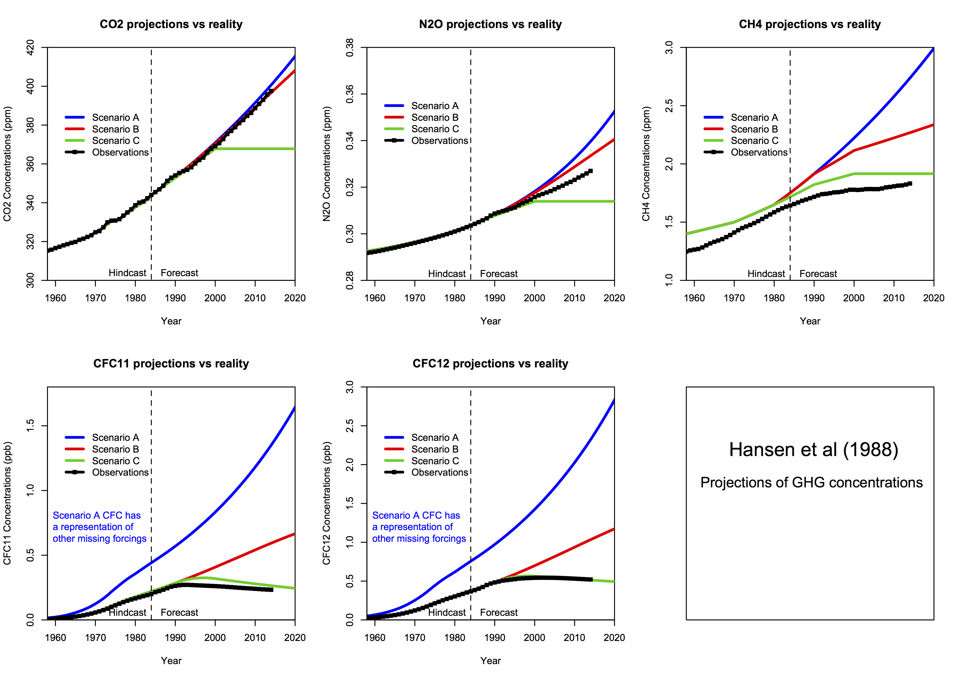
For comparison, Steve McIntyre showed graphs for his Scen_2, with data to 2008 only. There is no visual difference from scenario plots of Scen_1.
Gavin also gave this plot of forcing, which demonstrates that when put together, the outcome is between scenarios B and C. This was also Steve McIntyre's conclusion back in 2008.
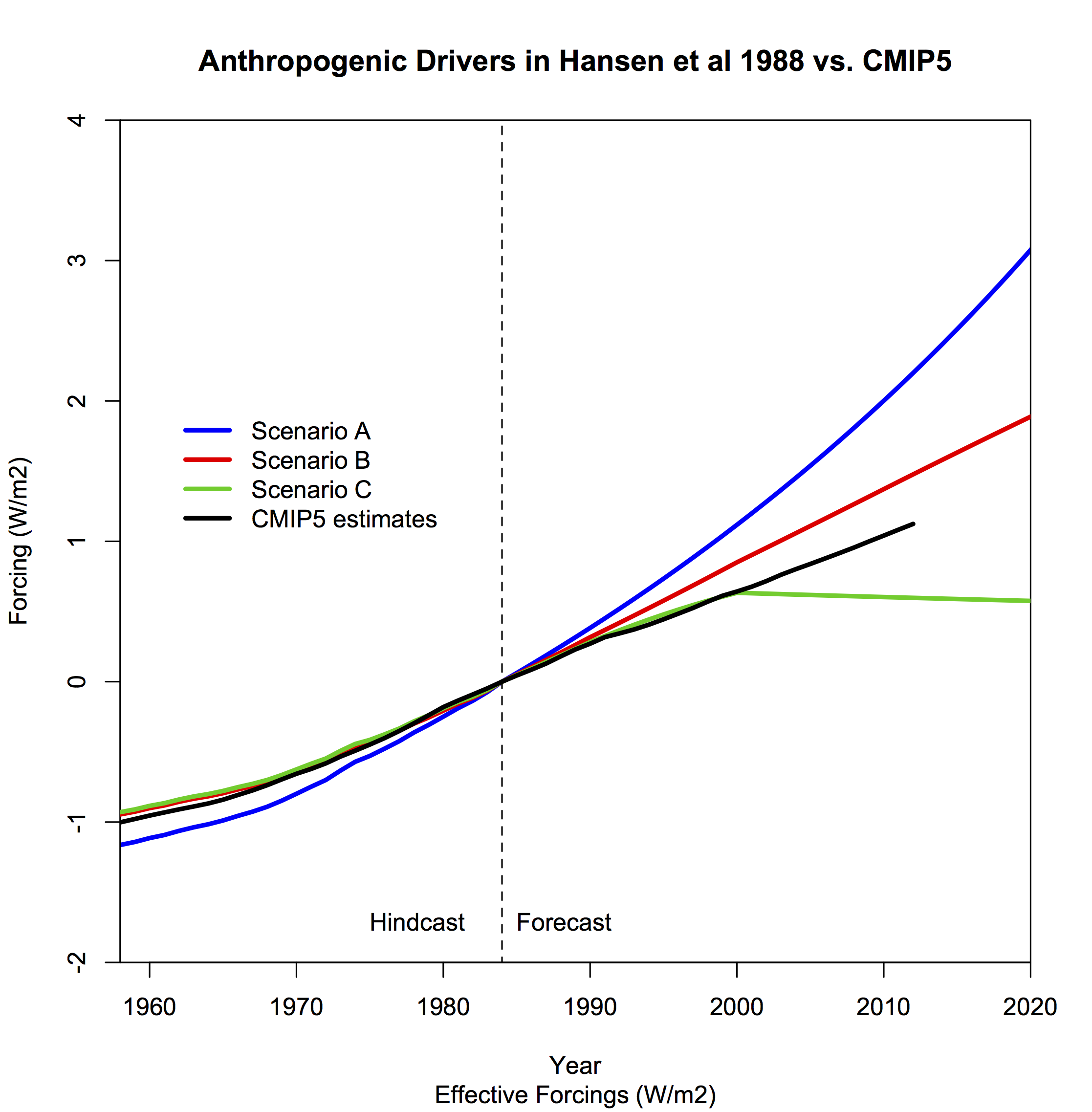
And here is another forcings graph, this time from Eli's posts in 2006 linked above (click to enlarge):

Anyway, for the record, I would like to set down some clarification of what the scenarios for the predictions actually were, and what to make of them. Some trouble has been caused by Hansen's descriptions, which were not always clear. This is exacerbated by readers who interpret in terms of modern much discussed knowledge of tonnage emissions of CO2. This is an outgrowth of the UNFCC in early 1990's getting governments to agree to collect data on that. Although there were estimates made before 1988, they were without benefit of this data collection, and Hansen did not use them at all. I don't know if he was aware of them, but he in any case preferred the much more reliable CO2 concentration figures.
Sources
I discussed the sources and their origins in a 2016 post here. For this, let me start with a list of sources:- Hansen's 1988 prediction paper and a 1989 paper with more details, particularly concerning CFCs
- Some discussions from 10 years ago: Real Climate and Steve McIntyre (later here). SM's post on scenario data here. See also Skeptical Science
- A 2006 paper by Hansen, which reviews the predictions
- From that 2007 RC post, a link to data files - scenarios and predicted temperature. The scenarios are from the above 1989 paper. I'll call this data Scen_1
- A RealClimate page on comparisons of past projections and outcomes
- A directory of a slightly different data set from Steve McIntyre here, described here. I'll call that Scen_2. The post has an associated set of graphs. It seems that SM calculated these from Hansen's description.
- A recent Real Climate post with graphs of scenarios and outcomes, and also forcings.
- I have collected numerical ascii data in a zipfile online here. H88_scenarios.csv etc are Scen_1; hansenscenario_A.dat etc are Scen_2, and scen_ABC_temp.data.txt is the actual projection.
Hansen's descriptive language
The actual arithmetic of the scenarios is clear, as I shall show below. It is confirmed by the numbers, which we have. But it is true that he speaks of things differently to what we would now. Steve McIntyre noted one aspect when Hansen speaks of emissions increasing by 1.5%:"One idiosyncrasy that you have to watch in Hansen's descriptions is that he typically talks about growth rates forthe increment , rather than growth rates expressed in terms of the quantity. Thus a 1.5% growth rate in the CO2 increment yields a much lower growth rate than a 1.5% growth rate (as an unwary reader might interpret)."
Hansen is consistent though. His conventions are
- Emissions of CO2 are always spoken of in terms of % increase. Presumably this is because he uses tonnages for CFCs, where production data is better than air measurements, and % works for both. Perhaps he anticipated having CO2 tonnages some time in the future.
- So emissions, except for CFCs, are actually quantified as annual increments in ppm. He does not make this link very explicitly, but there is nothing else it could be, and talk of a % increase in emissions translates directly into a % increase in annual ppm increment in the numbers.
- As SM said, you have to note that is is % of increment, not % of ppm. The latter would in any case make no sense. In Appendix B, the description is in terms of increments
- Another usage is forcings. This gets confusing, because he reports it as ΔT, where we would think of it in W m-2. He gives in Appendix B for CO2 as the increment from x0=315 ppm of a log polynomial function the current ppm value. This is not far from proportional to the difference in ppm from 315. Other gases are also given by such formulae.
- An exception to the use of concentrations is the case of CFCs. Here he does cite emissions in tons, relying on manufacturing data. Presumably that is more reliable than air measurement.
Arguments
Update. Eli notes in comments that he went through a lot of this in 2006, here, and continued here. I'll show his forcing graph below.
- Ignoring scenarios
Many people want to say that Hansen made a prediction, and ignore scenarios altogether. So naturally they go for the highest, scenario A, and say that he failed. An example Noted by SkS was Pat Michaels, testifying to Congress in 1998, in which he showed only Scenario A. Michaels, of course, was brought on again to review Hansen after 30 years, in WSJ. This misuse of scen A was later taken up by Michael Crichton in "State of Fear", in which he said that measured temperature rise was only a third of Hansen's prediction. That was of course based, though he doesn't say so, on scenario A, which wasn't the one being followed.
In arguing with someone rejecting scenarios at WUWT, I was told that an aircraft designer who used scenarios would be in big trouble. I said no. An aircraft designer will not give an absolute prediction of performance of the plane. He might say that with a load of 500 kg, the performance will be X, and with 1000 kg, it will be Y. Those are scenarios. If you want to test his performance specs, you have to match the load. It is no use saying - well, he thought 500 kg was the most likely load, or any such. You test the performance against the load that is actually there. And you test Hansen against the scenario that actually happened, not some construct of what you think ought to have happened. - Misrepresenting scenarios
This is a more subtle one, that I am trying to counter in this post.People want to declare that scenario A was followed (or exceeded) because tonnage emissions increased by more than the 1.5% mentioned in Hansen. There are variants. These are harder to counter because Hansen made mainly qualitative statements in his text, with the details in Appendix B, and not so clear even there.
But there isn't any room for doubt. We have the actual numbers he used (see sources). They make his description explicit. And they are defined in terms of gas concentrations only (except for CFCs). Issues about how tonnage emissions grew, or the role of China, or change in airborne fraction, are irrelevant. He worked on gas concentration scenarios, and as I shall show, the match with scenario B was almost exact (Scen A is close too).
Scenario arithmetic for CO2
. As mentioned, Hansen defined scenario A as emissions rising by 1.5% per year, compounded. The others differed by a slightly slower rate to year 2000. Scenario B reverted to constant increases after 2010, while scenario C had zero increases in CO2 ppm thereafter. See the graphs below. With all the special changes in Scenario B, it still didn't get far from Scenario A over the 30 years.The basic arithmetic for Scenario A is that, if a1, a2, a3 are successive annual averages of CO2 ppm, then
(a3-a2)/(a2-a1) = 1.015
or the linear recurrence relation a3 = a2 +1.015*(a2 - a1)
There is an explicit solution of this for scen_2, which is the set Steve Mc calculated:
CO2 ppm = 235 + 117.1552*1.015^n where n is the number of years after 1988. That generates the dataset.
The formula for the actual Hansen set is slightly different. Oddly, the increment ratio is now not 1.015, but 1.0151131. This obviously makes little difference in practice; I think it arises from setting the monthly increment to 0.125% and compounding monthly. However
1.00125^12 = 1.015104 which is close but not exact. Perhaps there was some rounding.
Anyway, with that factor, the revised formula for Scen_1 is
Scen A: CO2 ppm = 243.8100 + 106.1837*1.0151131^n
Scenario B is much more fiddly from 1988-2000, though a straight line thereafter. Hansen describes it thus
"In scenario B the growth of the annual increment of CO2 is reduced from 1.5% yr-1 today to 1% yr-1 in 1990, 0.5% yr-1 in 2000, and 0 in 2010; thus after 2010 the annual increment CO2 is constant, 1.9 ppmvyr-1".
It isn't much use me trying to write an explicit formula for that. All I can report is that Scen_1 does implement that. I also have to say that this definition is too fiddly; the difference between A and B after all that fussy stuff is only 0.44 ppm at year 2000.
Scenario C is then CO2 ppm = 349.81 + 1.5*n for n=0:12; then constant at 367.81.
Conclusion
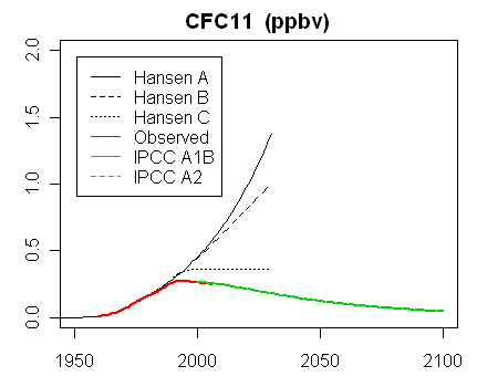
Hansen's descriptions of the scenarios are not always clear. But we have the numbers used, and then it is seen to be consistent, with the scenarios defined entirely in terms of gas concentrations.Graphs
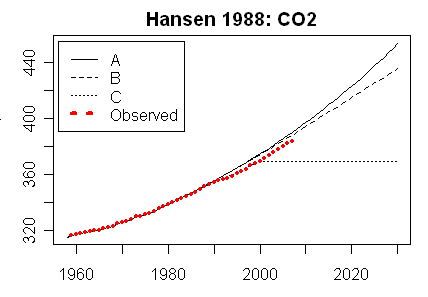
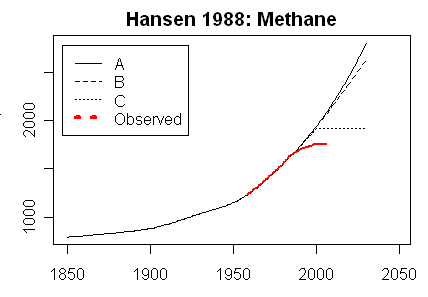
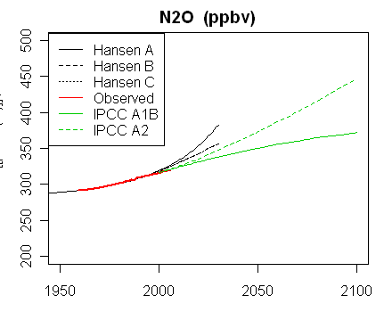
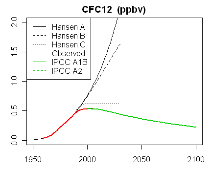
In the latest RealClimate, Gavin showed plots of the graphs and data for trace gases. Note how the data for CO2 sits right on scenario B. This is the Scen_1 data (click to enlarge):For comparison, Steve McIntyre showed graphs for his Scen_2, with data to 2008 only. There is no visual difference from scenario plots of Scen_1.
 |
 |
 |
 |
 |
Gavin also gave this plot of forcing, which demonstrates that when put together, the outcome is between scenarios B and C. This was also Steve McIntyre's conclusion back in 2008.
And here is another forcings graph, this time from Eli's posts in 2006 linked above (click to enlarge):
Saturday, June 23, 2018
Hansen's 1988 predictions - 30 year anniversary.
It is thirty years ago since James Hansen's famous Senate testimony on global warming. This has been marked by posts in Real Climate and WUWT (also here), and also ATTP, Stoat, Tamino. As you might expect, I have been arguing at WUWT.
The more substantive discussion is on the accompanying 1988 prediction paper. This was a remarkable achievement, which used runs of an early GISS GCM to forecast temperatures for the next thirty years. These forecasts are now often checked against observations. I wrote about them here, here and here. Each post had an active plotter which allowed you to superimpose various observation data on Hansen's original model results. It's annual data, to match Hansen's prediction. Since sientists can't know how much carbon society will choose to burn, Hansen analysed three scenarios (A, B and C) which covered the range between no restraint and successful limiting. Arguments then ensue as to which scenario actually happened. At least, that is what people should argue about, although they have a tendency to drift off into "Hansen said..." or even orse "we were told...".
Anyway, I'll leave discussion of that for the moment, and show the interactive plotter. The diagram in the background is Hansen's original plot, which is of anomalies relative to base years 1951-80, and uses GISS Ts as the observed data set (this had recently been published (Hansen and Lebedeff)). I have used that base where possible, else I match the dataset to GISS Ts over 1981-2010 (satellite data). Data is annual to end 2017. Sources are linked here.
To operate, just choose datasets to plot using the radio buttons, and Clear All if you want to start again. You can't erase curves without restart.
In interpreting these, I think weight should be given to GISS Ts, since it is what Hansen had available and used. Later indices incorporating SST rise more slowly. And I have reluctantly included troposphere data, which is definitely not what Hansen was predicting. Properly interpreted, I think the predictions are excellent. But that comes back to deciding which scenario is appropriate. I discussed this extensively here. We have detailed versions of the sequences of gas concentrations that quantified the scenarios, and while CO2 followed scenario B, others were much lower. CH4 and CFCs were below scenario C, so overall a result between B and C is to be expected. And that is what is mostly observed, though GISS Ts is higher.
Update. I have a zipfile online here which has numerical data for both scenario gases and temperature prediction; details here. I used it to calculate trends, in °C/Century, for the 30 years 1988-2017: (Further update - I fixed an error in scenario rates - now trend for B is larger)
In that analysis of scenarios, I showed some old plots. Gavin Schmidt, at Real Climate, has shown some updated values, and I'll show his plots. I mentioned that there are two sets of scenario data. One is IMO the original, as I discuss there, but Gavin uses a slightly different set, which I think was digitised from graphs. Anyway, here is the RC plot:

For the CFC plots; scenario C assumed that the Montreal agreements on curbing them, still being negotiated, would be approved and would work. A and B were more sceptical, but C was right. For methane, the concentration not only rose rather slowly, but was revised downward even before 1988.
Overall, in placing the outcome between scenarios B and C, Gavin gives this plot of combined forcings:

What the showing of combined temperature records shows is that Hansen's 1988 prediction is about as good as it could be, because it sits within the scatter of modern records. The difference between GISS Ts and GISS land/ocean is comparable to the difference between GISSlo and scenario B.
As a check on my active plot above, here is RealClimate's rendition of the case for GISS land/ocean with the same scenarios:

The more substantive discussion is on the accompanying 1988 prediction paper. This was a remarkable achievement, which used runs of an early GISS GCM to forecast temperatures for the next thirty years. These forecasts are now often checked against observations. I wrote about them here, here and here. Each post had an active plotter which allowed you to superimpose various observation data on Hansen's original model results. It's annual data, to match Hansen's prediction. Since sientists can't know how much carbon society will choose to burn, Hansen analysed three scenarios (A, B and C) which covered the range between no restraint and successful limiting. Arguments then ensue as to which scenario actually happened. At least, that is what people should argue about, although they have a tendency to drift off into "Hansen said..." or even orse "we were told...".
Anyway, I'll leave discussion of that for the moment, and show the interactive plotter. The diagram in the background is Hansen's original plot, which is of anomalies relative to base years 1951-80, and uses GISS Ts as the observed data set (this had recently been published (Hansen and Lebedeff)). I have used that base where possible, else I match the dataset to GISS Ts over 1981-2010 (satellite data). Data is annual to end 2017. Sources are linked here.
To operate, just choose datasets to plot using the radio buttons, and Clear All if you want to start again. You can't erase curves without restart.
In interpreting these, I think weight should be given to GISS Ts, since it is what Hansen had available and used. Later indices incorporating SST rise more slowly. And I have reluctantly included troposphere data, which is definitely not what Hansen was predicting. Properly interpreted, I think the predictions are excellent. But that comes back to deciding which scenario is appropriate. I discussed this extensively here. We have detailed versions of the sequences of gas concentrations that quantified the scenarios, and while CO2 followed scenario B, others were much lower. CH4 and CFCs were below scenario C, so overall a result between B and C is to be expected. And that is what is mostly observed, though GISS Ts is higher.
Update. I have a zipfile online here which has numerical data for both scenario gases and temperature prediction; details here. I used it to calculate trends, in °C/Century, for the 30 years 1988-2017: (Further update - I fixed an error in scenario rates - now trend for B is larger)
| 
|
In that analysis of scenarios, I showed some old plots. Gavin Schmidt, at Real Climate, has shown some updated values, and I'll show his plots. I mentioned that there are two sets of scenario data. One is IMO the original, as I discuss there, but Gavin uses a slightly different set, which I think was digitised from graphs. Anyway, here is the RC plot:
For the CFC plots; scenario C assumed that the Montreal agreements on curbing them, still being negotiated, would be approved and would work. A and B were more sceptical, but C was right. For methane, the concentration not only rose rather slowly, but was revised downward even before 1988.
Overall, in placing the outcome between scenarios B and C, Gavin gives this plot of combined forcings:
What the showing of combined temperature records shows is that Hansen's 1988 prediction is about as good as it could be, because it sits within the scatter of modern records. The difference between GISS Ts and GISS land/ocean is comparable to the difference between GISSlo and scenario B.
As a check on my active plot above, here is RealClimate's rendition of the case for GISS land/ocean with the same scenarios:
Tuesday, June 19, 2018
GISS May global down 0.03°C from April.
The GISS land/ocean temperature anomaly fell 0.03°C last month. The May anomaly average was 0.82°C, down slightly from April 0.85°C. The GISS report notes that it is the fourth warmest May in the record. The decline is very like the 0.038°C fall, of TempLS Mesh, although the NCEP/NCAR index declined rather more.
The overall pattern was similar to that in TempLS. Warm in most of N America, and equally warm in Europe, especially around the Baltic. Warm in East Asia, especially Siberia. Antarctica mostly warm. Still a pattern of warm patches along about 40°S.
As usual here, I will compare the GISS and previous TempLS plots below the jump.
Sunday, June 10, 2018
May global surface TempLS down 0.038 °C from April.
The TempLS mesh anomaly (1961-90 base) fell a little, from 0.716°C in April to 0.678°C in May. This is less than the 0.09°C fall in the NCEP/NCAR index, while the satellite TLT indices fell by a similar amount (UAH 0.03°C).
It was very warm in much of N America, except NE Canada (cold), and very warm in Europe. Cold in E Siberia, but warm in East Asia generally. Again a pattern of warm blobs around 40-50 °S, though less marked than in recent months. Quite warm in Antarctica (relatively).
Here is the temperature map. As always, there is a more detailed active sphere map here.
Data from Canada delayed this report by a couple of days. Following my recent post on the timing of data arrival, I kept a note of how the TempLS estimates changed day by day as May data came in. The TempLS report is now first posted when the SST results are available, but I wait until all large countries are in before writing a post about it. Here is the table (Melbourne time):
Canada (late) did have a cooling effect.
Read More
It was very warm in much of N America, except NE Canada (cold), and very warm in Europe. Cold in E Siberia, but warm in East Asia generally. Again a pattern of warm blobs around 40-50 °S, though less marked than in recent months. Quite warm in Antarctica (relatively).
Here is the temperature map. As always, there is a more detailed active sphere map here.
Data from Canada delayed this report by a couple of days. Following my recent post on the timing of data arrival, I kept a note of how the TempLS estimates changed day by day as May data came in. The TempLS report is now first posted when the SST results are available, but I wait until all large countries are in before writing a post about it. Here is the table (Melbourne time):
| Date | Number stations (incl SST) | Temperature | |
| June 05 | 4516 | 0.676 | |
| June 06 | 4829 | 0.723 | |
| June 07 | 5294 | 0.709 | |
| June 08 | 5372 | 0.708 | |
| June 09 | 5381 | 0.709 | |
| June 10 | 5474 | 0.678 |
Canada (late) did have a cooling effect.
Read More
Sunday, June 3, 2018
May NCEP/NCAR global surface anomaly down by 0.09°C from April
In the Moyhu NCEP/NCAR index, the monthly reanalysis anomaly average fell from 0.377°C in April to 0.287°C in May, 2018. This cancels out the last two months of increase, and matches the February average.
It was for once warm in both in North America (except far N) and Europe especially Scandia. Russia was cold in the W, warm in the East. Nothing special at either pole. Probably the main contributor to the drop was a chill in the N Atlantic region, including Greenland. Active map here.
I had thought that the gradual warming might be associated with the decline of La Niña. But the changes are small, so shouldn't be over-interpreted. The BoM still says that ENSO is neutral, and likely to stay so for a few months.
Thursday, May 31, 2018
To see the month's GHCN coverage, patience is needed.
I often see on contrarian sites graphs, usually from NOAA, which are supposed to show how sparse is GHCN-M's coverage of land sites, as used by the major US temperature indices. The NOAA monthly reports usually show interpolated plots, but if you go to some legacy sites, you can get a plot like this:
It is a 5x5° grid, but it does look as if there are a lot of empty cells, particularly in Africa. But if you look at the fine print, it says that the map was made April 13. That is still fairly early in the month, but NOAA doesn't update. There is a lot of data still to come. Station coverage isn't ideal, but it isn't that bad.
I took issue with a similar graph from SPPI back in 2010. That was quite a high visibility usage (GISS this time). Fortunately GISS was providing updates, so I could show how using an early plot exaggerated the effect.
The issue of spread out arrival of data affects my posting of monthly TempLS results. I calculate a new monthly average temperature each night, for the current month. I post as soon as I can be reasonably confident, which generally means when the big countries have reported (China, Canada etc). I did comment around January that the temperatures were drifting by up to about 0.04°C after posting. I think that was a run of bad luck, but I have been a little more conservative, with stabler results. Anyway, I thought I should be more scientific about it, so I have been logging the arrival date of station data in GHCN-M.
So I'll show here an animation of the arrival of March 2018 data. The dates are when the station data first appears on the posted GHCN-M file. Click the bottom buttons to step through.
The colors go from red when new to a faded blue. The date is shown lower left.
The behaviour of the US is odd, and I'll look into it. About 500 stations post numbers in the last week of February. I presume these are interim numbers, but my logging didn't record changing values. Then another group of stations report mid April.
Otherwise much as expected. The big countries did mainly report by the 8th. A few medium ones, like South Africa, Mongolia, Iran and Sudan, were quite a lot later. But there is substantial improvement in overall coverage in the six weeks or so after April 1. Some of it is extra stations that arrive after a country's initial submission.
There certainly are parts of the world where more coverage would be useful, but it doesn't help to exaggerate the matter by showing incomplete sets. The good news from the TempLS experience is that, even with an early set, the average does not usually change much as the remaining data arrives. This supports the analysis here, for example, which suggests that far fewer stations, if reasonably distributed, can give a good estimate of the global integral.
Tuesday, May 29, 2018
Updating the blog index.
I wrote late last year about improving the blog topic index, which is top on the page list, to right. I've now tinkered a bit more. The main aim was to automate updates. This should now work, so the index should always be up to date.
The other, minor improvement was to add a topic called "Complete listing" This does indeed give a listing of all posts, with links, back to the beginning of the blog in 2009. It includes pages, too (at the bottom), so there are currently 751 in the list, organised by date.
The other, minor improvement was to add a topic called "Complete listing" This does indeed give a listing of all posts, with links, back to the beginning of the blog in 2009. It includes pages, too (at the bottom), so there are currently 751 in the list, organised by date.
Friday, May 25, 2018
New interactive updated temperature plotting.
As part of the Moyhu latest data page, I have maintained a daily updated interactive plotter. I explained briefly the idea of it here. There is a related and more elaborate annual plotter kept as a page here, although I haven't kept that updated.
I think interactive plotting is a powerful Javascript capability. You can move the curves around as you wish - expanding or contracting the scales. You can choose which of a large set of data offerings to show. You can smooth and form regression lines.
But the old version, shown with that old post, looks a bit raw. I found I was using it more for display graphs, so I have cleaned up the presentation, using PrintScreen on my PC, and pasting the result into Paint. I have also simplified the controls. I had been using draggable popup windows, which are elegant, but not so straightforward, and don't make it easy to expand facilities. So I have reverted to an old-fashioned control panel, in which I can now include options such as writing your own headings and y-axis label. There is now also the option of changing the anomaly base, and you can choose any smoothing interval. Here is how it looks, in a working version:
You can choose data by clicking checkboxes on the left. Dragging in the main plot area translates the plots; dragging the pointer under the x-axis changes the time scale, and dragging vertically left of the y-axis changes the y-scale. At bottom left (below the checkboxes), there is a legend, only partly visible. This reflects the colors and choice of data, and you can drag it anywhere. The idea is that you can place it on the plot when you want to capture the screen for later presentation.
The control panel has main rows for choosing the regression, smoothing and anomaly base. When you want to make a choice, first tick the relevant checkbox, and then enter data in the textboxes. Then yo make it work, click the top right run button. The change you make will apply either to all the curves, or just to one nominated on the top row, depending on the radio buttons top left. The nominated curve is by default the last one chosen, but you can vary this with the arrow buttons just left of the run button. However, the anomaly base can only be altered for all, and the color selection only for one.
Choosing regression over a period displays the line, and also the trend, in the legend box, in °C/century units. You can only have one trend line per dataset, but possibly with different periods. If you want to make a trend go away, just enter a date outside the data range (0 will do). You could also deselect and reselect the data.
Smoothing is just moving average, and you enter the period in months. Enter 1 for no smoothing (also the default).
There are two rows where you can enter your own text for the title and y-axis label. Click run to make it take effect. The title can include any HTML, eg bold, text-size etc. You can use heading tags, but that takes up room.
Color lets you choose from the colored squares. A choice takes effect immediately, for the nominated data only.
Generally keep the checkboxes in the control panel unchecked unless you are making a change.
For anomaly base, you can also enter an out of range year to get no anomaly modification at all. The plots are shown each with the suppliers base. I don't really recommend this, and it tends to get confused if you have already varied base choices.
There are two more buttons, on the right of the control panel. One is Trendback. This switches (toggles) to a style which was in the old version, and is described here, for example. It shows the trend from the time on the x-xis to present (last data) in °C/century. In that mode, it won't respond to the regression, smooth, or anomaly base properties. The other button is "Show data". This will make a new window with the numbers graphed on the screen. This can be quite handy for the trendback plots, for example. You can save the window to a file.
Here is how the plot might look if you drag the legend into place: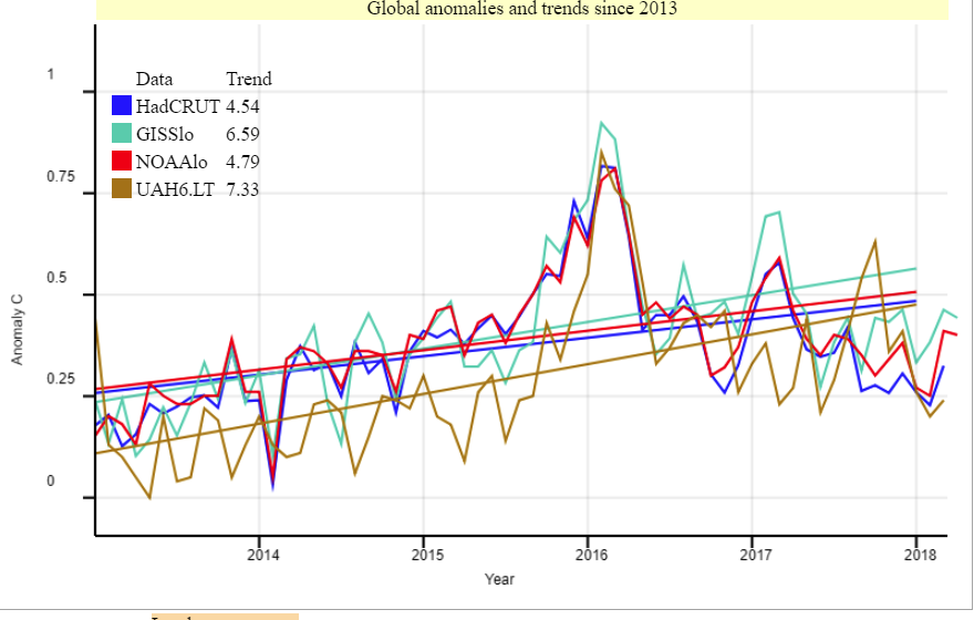
Thursday, May 17, 2018
GISS April global down 0.02°C from March.
The GISS land/ocean temperature anomaly fell 0.02°C last month. The April anomaly average was 0.86°C, down slightly from March 0.88°C. The GISS report notes that it is still the third warmest April in the record. The fall is very similar to the 0.016°C fall, of TempLS Mesh, although the NCEP/NCAR index showed a slight rise.
The overall pattern was similar to that in TempLS. Cold in most of N America, and contrasting warmth in Europe. Warm in East Asia, especially arctic Siberia. Polar regions variable. Warm in S America and Australia, and for at least the third month, a curious pattern of warm patches along about 40°S.
As usual here, I will compare the GISS and previous TempLS plots below the jump.
Tuesday, May 15, 2018
Electronic circuit climate analogues - amplifiers and nonlinearity
This post is a follow-up to my previous post on feedback. The main message in that post was that, although talking of electronic analogues of climate feedback is popular in some quarters, it doesn't add anything mathematically. Feedback talk is just a roundabout way of thinking about linear equations.
Despite that, in this post I do want to talk more about electronic analogues. But it isn't much about feedback. It is about the other vital part of a feedback circuit - the amplifier, and what that could mean in a climate context. It is of some importance, since it is a basic part of the greenhouse effect.
The simplest feedback diagram (see Wiki) has three elements:

They are the amplifier, with gain AOL, a feedback link, with feedback fraction β, and an adder, shown here with a minus sign. The adder is actually a non-trivial element, because you have to add the feedback to the input without one overriding the other. In the electronic system, this generally means adding currents. Adding voltages is harder to think of directly. However, the block diagram seems to express gain of just one quantity, often thought of as temperature.
In the climate analogue, temperature is usually related to voltage, and flux to current. So there is the same issue, that fluxes naturally add, but temperature is the variable that people want to talk about. As mentioned last post, I often find myself arguing with electrical engineers who have trouble with the notion of an input current turning into an output voltage (it's called a transimpedance amplifier).
If you want to use electronic devices as an analogue of climate, I think a fuller picture of an amplifier is needed. People now tend to show circuits using op amps. These are elaborately manufactured devices, with much internal feedback to achieve high linearity. They are differential, so the operating point (see below) can be zero. I think it is much more instructive to look at the more primitive devices - valves, junction transistors, FETs etc. But importantly, we need a fuller model which considers both variables, voltage and current. The right framework here is the two port network.
I've reached an awkward stage in the text where I would like to talk simultaneously about the network framework, junction transistors, and valves. I'll have to do it sequentially, but to follow you may need to refer back and forth. A bit like a feedback loop, where each depends on the other. I'll go into some detail on transistors, because the role of the operating point, fluctuations and linearity, and setting the operating point are well documented, and a good illustration of the two port treatment. Then I'll talk about thermionic valves as a closer analogue of climate.
Two Port Network
Wiki gives this diagram:
As often, engineer descriptions greatly complicate some simple maths. Many devices can be cast as a TPN, but all it means is that you have four variables, and the device enforces two relations between them. If these are smooth and can be linearised, you can write the relation for small increments y as
Wiki, like most engineering sources, lists many ways you could choose the variables for left and right. For many devices, some coefficients are small, so you will want to be sure that A is not close to singular. I'll show how this works out for junction transistors.
This rather general formulation doesn't treat the input and output variables separately. You can have any combination you like (subject to invertible A). For linearity, the variables will generally denote small fluctuations; the importance of this will appear in the next section.
The external circuitry will contribute extra linear equations. For example, a load resistor R across the output will add an Ohm's Law, V₂ = I₂R. Other arrangements could provide a feedback equation. With one extra relation, there is then just one free variable. Fix one, say an input, and everything else is determined.
Junction transistors
I'm showing the use of a junction transistor as amplifier because it is a well documented example of:- a non-linear device which has a design point about which fluctuations are fairly linear
- a degree of degeneracy, in that it is dominated by a strong association between I₁ and I₂, with less dependence on V₂ and little variation in V₁. IOW, it is like a current amplifier, with amplification factor β.
- there is simple circuitry that can stably establish the operating point.

The top corner shows the transistor with variables labelled; the three pins are emitter E, base B and collector C. In TPN terms, I₁ is the base current IB; I₂ is the current from collector to emitter IC, and V₂ is the collector to emitter voltage VCE. The curves relate V₂ and I₂ for various levels of I₁. Because they level off, the dependence is mainly between IC and IB. The load line in heavy black shows the effect of connecting the collector via a load resistor. This constrains V₂ and I₂ to lie on that line, and so both vary fairly linearly with I₁.
The following diagrams have real numbers and come from my GE transistor manual, 1964 edition, for a 2N 1613 NPN transistor. The left is a version of the design curves diagrammed above, but with real numbers. It shows as wavy lines a signal of varying amplitude as it might be presented as base current (top right) and appear as a collector voltage (below). The load resistor line also lets you place it on the y axis, where you can see the effect of current amplification, by a factor of about 100. The principal purpose of these curves is to show how non-linearity is expressed as signal clipping.
I have included the circuit on the right, a bias circuit, to show how the design operating point is achieved. The top rail is the power supply, and since the base voltage is near fixed at about 0,6V, the resistor RB determines the base current curve. The load RL determines the load line, so where these intersect is the operating point.
So let's see how this works out in the two-port formulation. We have to solve for two variables; the choice is the hybrid or h- parameters:
Hybrid suggests the odd combination; input voltage V₁ and output current I₂ are solved in terms of input current I₁ and output voltage V₂. The reason is that the coefficients are small, except for h₂₁ (also β). There is some degeneracy; there isn't much dependence at all on V₂, and V₂ is then not going to vary much.So these belong on the sides they are placed. I₂ and I₁ could be switched; that is called inverse hybrid (g-). I've used the transistor here partly as a clear example of degeneracy (we'll see more).
Thermionic valve and climate analogue
From Wiki comes a diagram of a triode
The elements are a heated cathode k in a vacuum tube, which can emit electrons, and an anode a, at positive voltage, to which they will move, depending on voltage. This current can be modulated by varying the voltage applied to the control grid g, which sits fairly close to the cathode.
I propose the triode here because it seems to me to be a closer analogue of GHGs in the atmosphere. EE's sometimes say that the circuit analogue of climate fails because they can't see a power supply. That is because they are used to fixed voltage supplies. But a current supply works too, and that can be seen with the triode. A current flows and the grid modulates it, appearing to vary the resistance. A FET is a more modern analogue, in the same way. And that is what happens in the atmosphere. There is a large solar flux, averaging about 240 W/m² passing through from surface to TOA, much of it as IR. GHGs modulate that flux.
A different two-port form is appropriate here. I₁ is negligible, so should not be on the right side. Inverse hyprid could be used, or admittance. It doesn't really matter which, since the outputs are likely to be related via a load resistor.
Climate amplifier
So thinking more about the amplifier in the climate analogue, first as a two port network. Appropriate variables would be V₁,I₁ as temperature and heat flux at TOA, and V₂, I₂ as temperature, upward heat flux at the surface. V₂ is regarded as an output, and so should be on the LHS, and I₁ as an input, on the right. One consideration is that I₂ is constrained as being the fairly constant solar flux at the surface, so it should be on the RHS. That puts V₁ on the left and pretty much leads to an impedance parameters formulation - a two variable form of Ohm's Law.The one number we have here is the Planck parameter, which gives the sensitivity before feedback of V₂ to I₁ (or vice versa). People often think that this is determined by the Stefan-Boltzmann relation, and that does give a reasonably close number. But in fact it has to be worked out by modelling, as Soden and Held explain. Their number comes to about 3.2 Wm⁻²/K. This is a diagonal element in the two port impedance matrix, and is treated as the open loop gain of the amplifier. But the role of possible variation of the surface flux coefficient should alos be considered.
As my earlier post contended, mathematically at least, feedback is much less complicated than people think. The message of this post is that if you want to use circuit analogues of climate, a more interesting question is, how does the amplifier work?
Subscribe to:
Posts (Atom)


